Arabic Cafe Logo Design: 32 Ideas & Branding Tips
Arabic cafe logo design can turn a coffee shop name into a memorable part of the customer experience. The best ideas connect clear Arabic lettering with the café’s atmosphere, menu and sense of place. They also work beyond a beautiful mockup: on a takeaway cup, a storefront sign and a tiny social profile.
This guide brings together 32 café and coffee branding references, with large images and practical lessons from each one. You will find expressive calligraphy, simple wordmarks, bilingual identities and packaging ideas. More importantly, you will learn how to choose a direction that fits your own café.
These projects are inspiration examples by their respective creators. Each image links back to its original Behance project. My comments focus on design choices you can learn from; the collection is not a claim that I designed these identities.
What makes Arabic cafe logo design work?
A useful café logo balances three things: a readable name, a distinct personality and reliable reproduction. Start with the Arabic spelling. Then choose a visual direction that matches the business. Finally, test the mark on the materials customers will actually see.
For example, an intimate neighbourhood café may suit relaxed handwritten lettering. A specialist roastery might need a compact mark that works on many bag labels. Meanwhile, a heritage-led coffee house may call for a more expressive calligraphic composition. None of these styles is automatically better. The right choice follows the brief.
- Readability: Can your audience identify the name without guessing?
- Distinctiveness: Does the composition differ from nearby competitors?
- Flexibility: Does it work in one colour, at small sizes and on curved packaging?
- Fit: Does the identity reflect the café’s actual experience?
Choose an Arabic cafe logo design direction
Expressive Arabic calligraphy
Calligraphy offers flowing strokes, distinctive silhouettes and a strong sense of craft. However, the details still need to survive production. Ask your designer for a simplified version when the main mark contains very fine lines or small internal spaces.
Modern Arabic wordmarks
A wordmark makes the café name the main visual asset. It can feel quiet, bold, playful or precise, depending on the letter construction. Avoid choosing a style only because it looks fashionable. First check the spelling, connections, proportions and character of the name.
Bilingual café identities
Arabic and English do not need identical shapes to look related. Instead, balance their weight, scale and visual rhythm. Also decide which language leads in each setting. Your main sign, delivery packaging and international-facing website may need different lockups.
Symbols and complete branding systems
A compact symbol can support the full wordmark on avatars, stamps or labels. Meanwhile, patterns, colour and photography build the wider identity. Give each element a job. A logo does not need to contain a cup, bean, coffee pot and architectural landmark at once.
32 Arabic cafe logo design ideas to explore
Look at the images at full width, then read the lesson beneath each one. Compare two or three directions before building your shortlist. As you browse, write down what you like about the lettering, hierarchy or application. That will make your feedback more useful than simply asking for something similar.
1. SKOUN: Arabic cafe logo design on takeaway cups
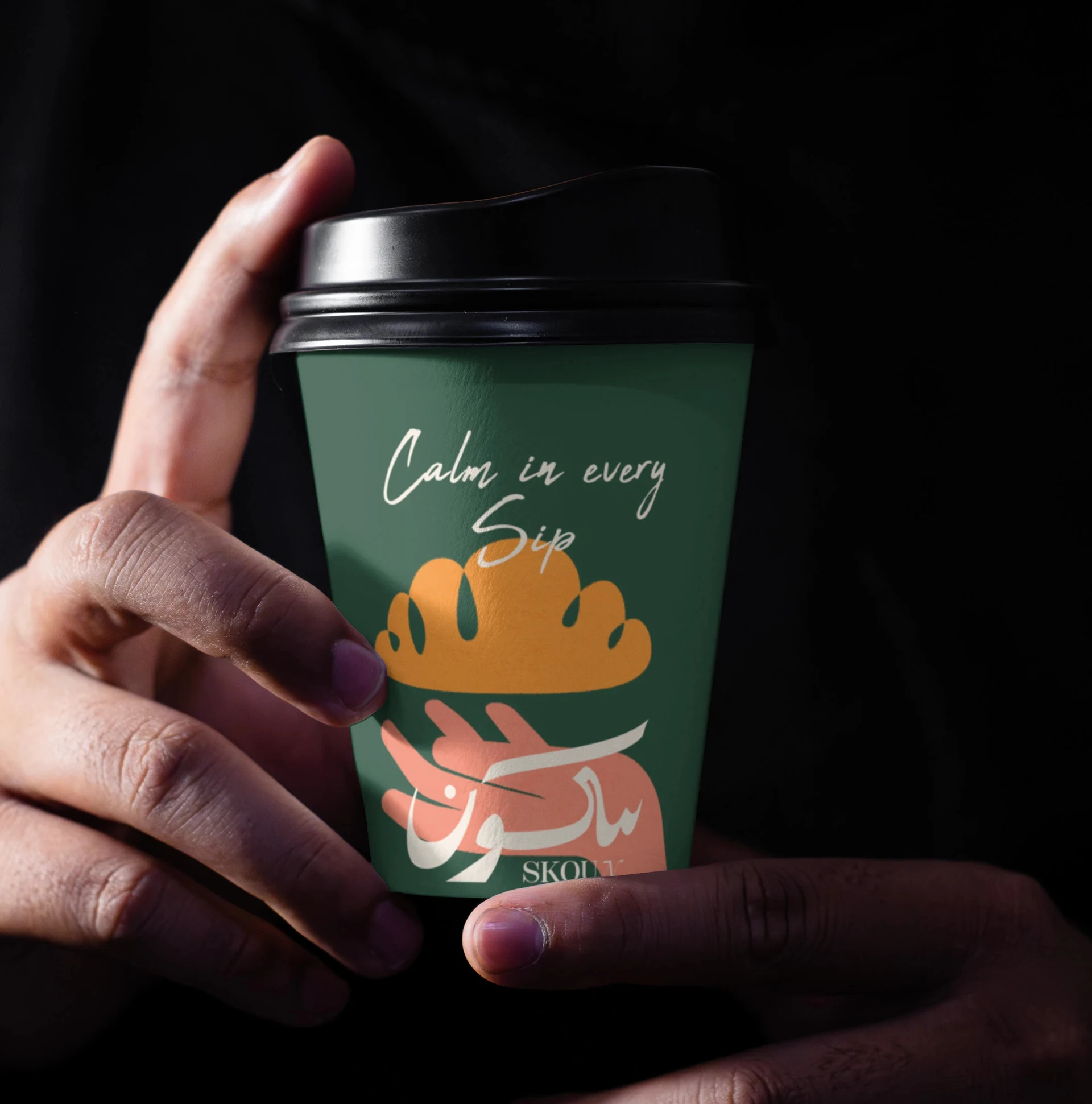
SKOUN pairs expressive lettering with a dark green cup and warm graphic accents. In particular, notice how the mark works on a curved surface. Judge your own logo on a real cup template, because a flat presentation can hide awkward spacing. Keep the name readable when someone holds the drink.
2. Riwaq: Arabic cafe logo design for storefront signs
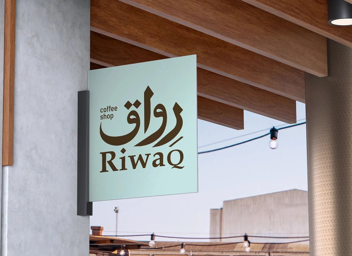
Riwaq places its Arabic and English names on a simple projecting sign. As a result, generous space around the lettering helps the identity stand out against the architecture. For your café, test the sign from across the street. Then check whether the English line supports the Arabic name without becoming too small to read.
3. MERKA: build a story around the wordmark
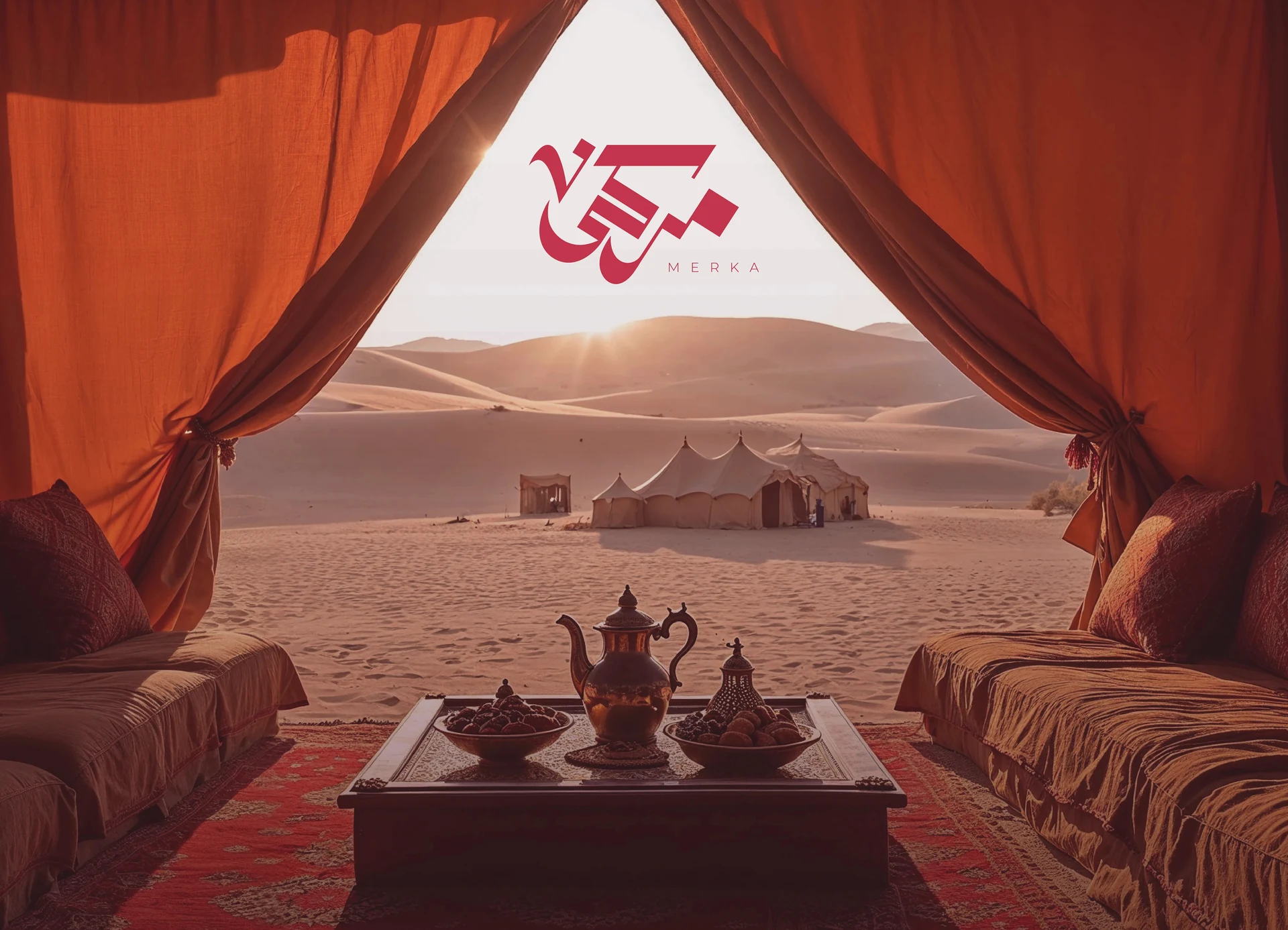
MERKA presents its mark within a warm desert scene. In particular, the setting gives the identity a clear sense of place, while the red lettering creates a focal point. Borrow the storytelling approach, rather than the artwork. Ask which local materials, gathering rituals or neighbourhood details could shape your own café story.
4. Rashfa: connect the identity to coffee rituals
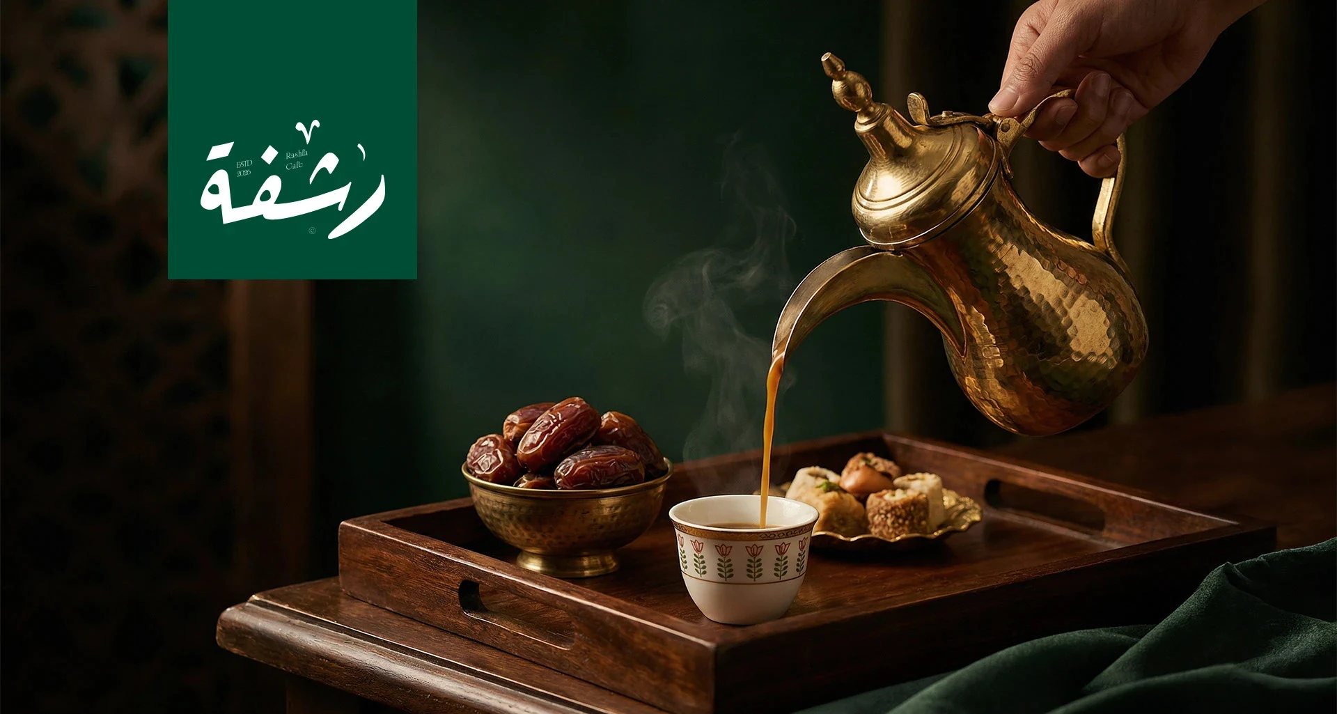
Rashfa combines white lettering, deep green and a familiar coffee-serving scene. Together, these elements communicate hospitality without asking the logo to explain everything. This is a useful Arabic cafe logo design reference for a heritage-led brand. Let photography and packaging carry part of the story, so the mark can stay clear.
5. FINGAN: design for the interior as well as the entrance
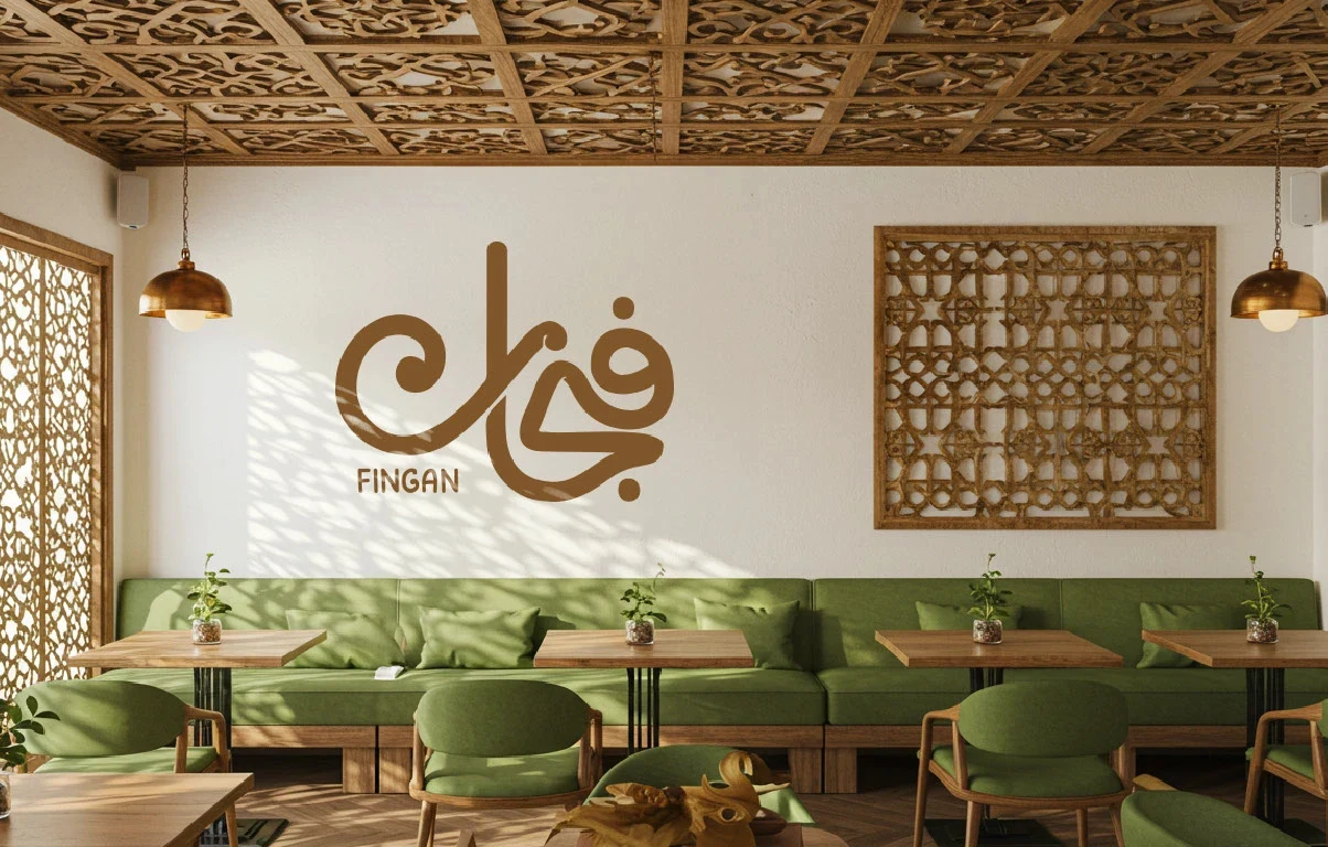
FINGAN shows how a wordmark can become part of the interior. For example, the gold lettering sits comfortably among carved details, warm materials and green seating. Notice the balance between the logo and its surroundings. A café with a richly detailed interior may need a calmer sign, rather than another layer of decoration.
6. BUN: a bold Arabic cafe logo design
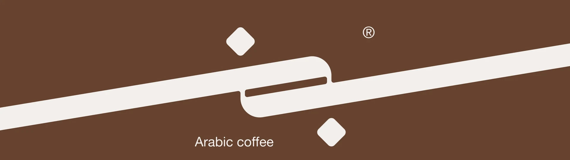
BUN makes a bold statement with a compact Arabic form and a long diagonal stroke. In particular, its visual impact comes from scale and contrast. However, a striking presentation still needs a practical small-size version. Test the complete name, its dots and the extended stroke on cup sleeves, stickers and social profiles.
7. Finjan: simplify the mark without losing meaning
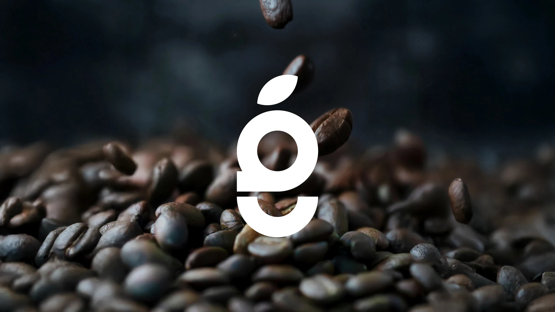
Finjan puts a white lettermark against dark coffee beans. As a result, the strong silhouette makes the symbol easy to locate, even with a textured background. When reviewing a simple mark, cover the brand name and ask whether the symbol remains distinctive. Also check it against competitors, since a minimal shape can feel familiar very quickly.
8. Mosaab: handwritten Arabic cafe logo design
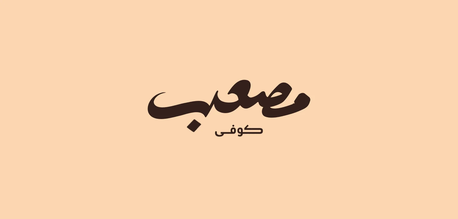
Mosaab uses a signature-like wordmark on a quiet background. In particular, its connected strokes create personality without relying on a cup icon. For a founder-led café, this approach can feel personal and direct. Pay close attention to the letters, though. Expressive Arabic lettering must still preserve the correct name and readable connections.
9. Tomora: make the identity work as a complete set
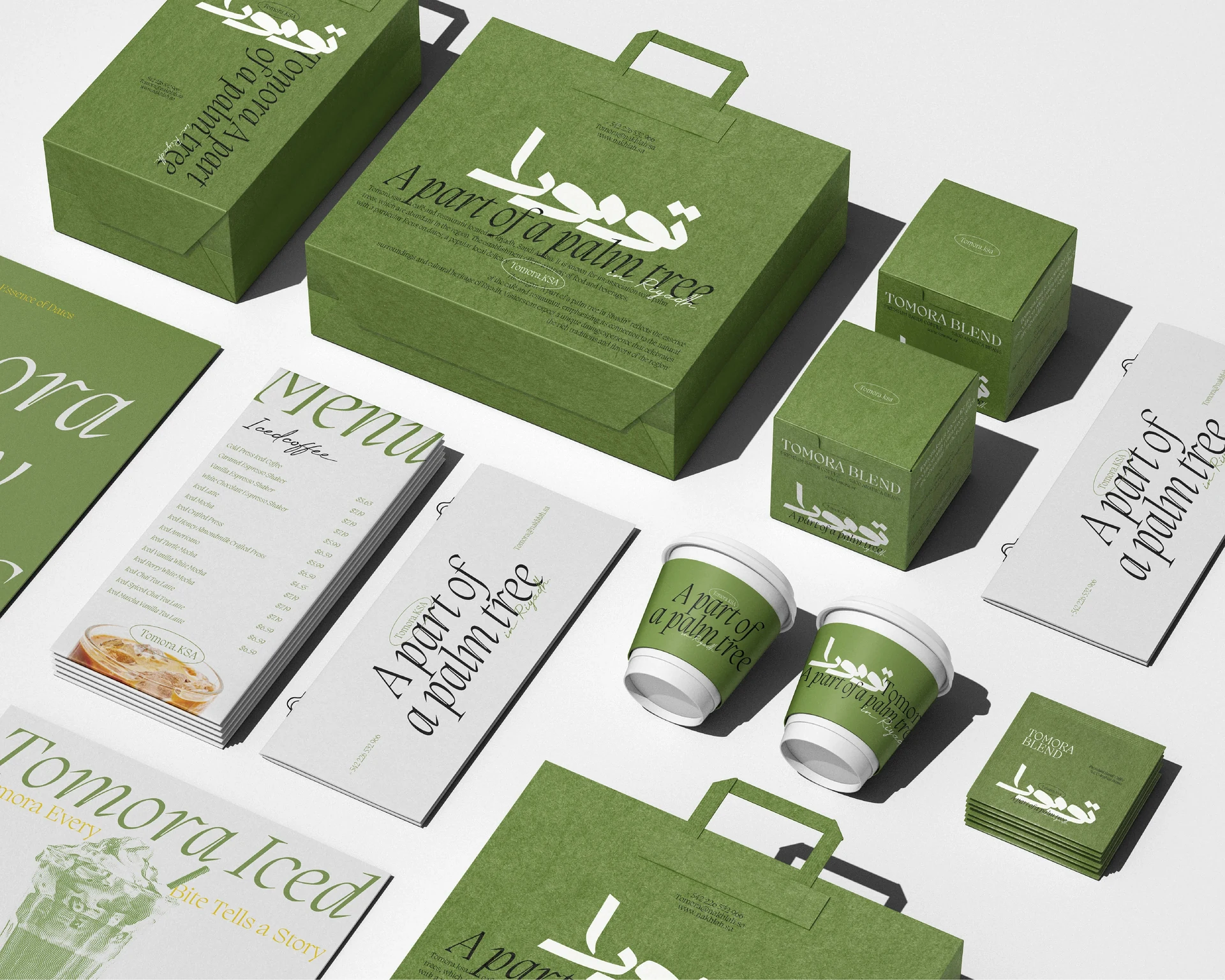
Tomora shows the brand across bags, boxes, cups and printed pieces. In addition, the repeated green palette links these different objects. Study this example when your project needs more than a single logo. A consistent system can use different layouts, provided that the typography, colour relationships and core mark still feel connected.
10. Coffiyeh: coordinate Arabic and English branding
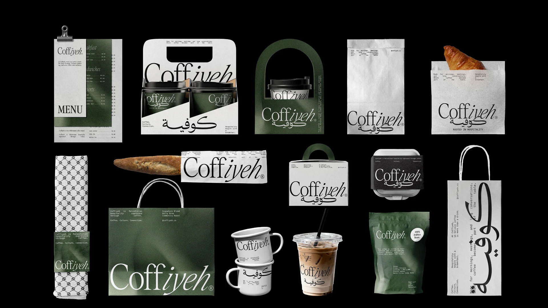
Coffiyeh demonstrates how several packaging formats can share a recognisable identity. In addition, Arabic and English lettering appear within a broader graphic system. This offers a useful question for bilingual cafés: do both scripts feel like parts of the same brand? Coordinate their visual weight and rhythm, rather than forcing them into identical letter shapes.
11. CAAS: explore ornamental Arabic cafe logo design
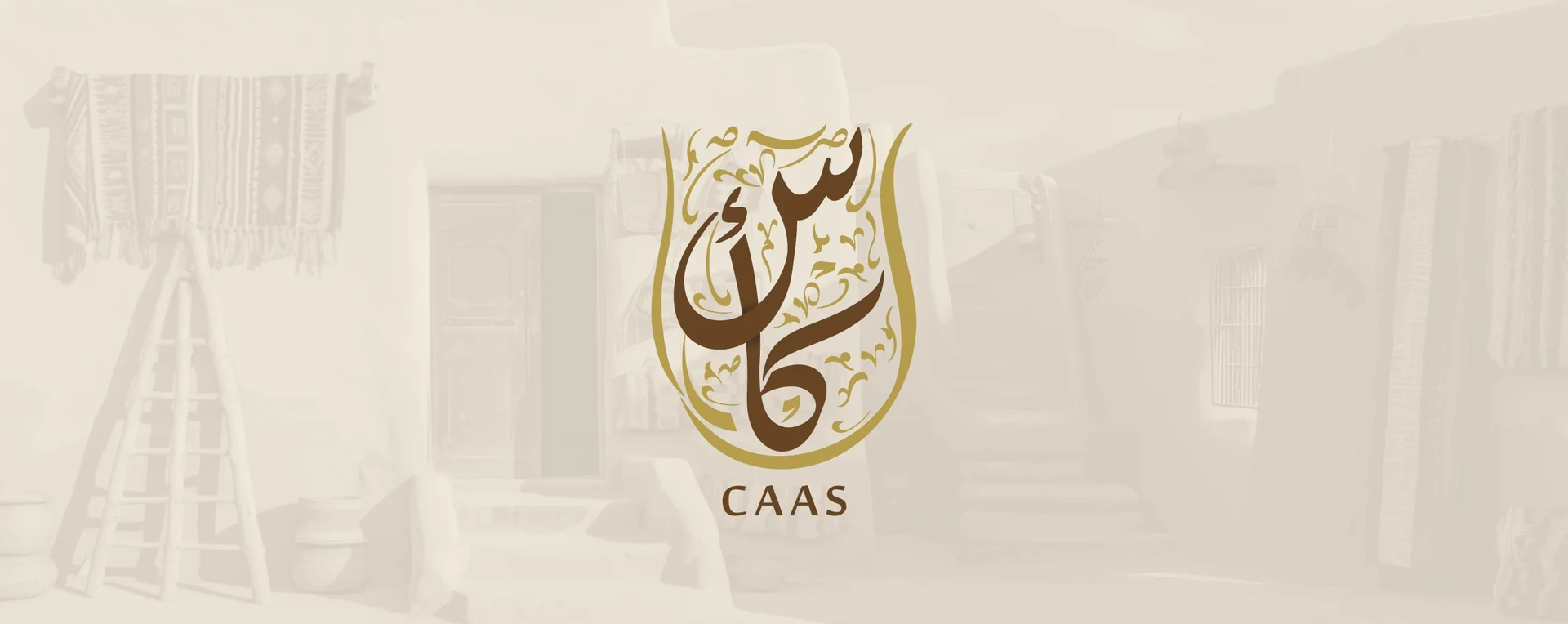
CAAS uses an ornamental composition with a coffee-pot-inspired outline. It suits a brief that calls for visible heritage and ceremony. However, intricate marks need a simpler companion version. Before approving a similar direction, print it at the size of your smallest sticker and check whether the inner spaces and fine strokes remain open.
12. Nada: Arabic cafe logo design with a floral symbol
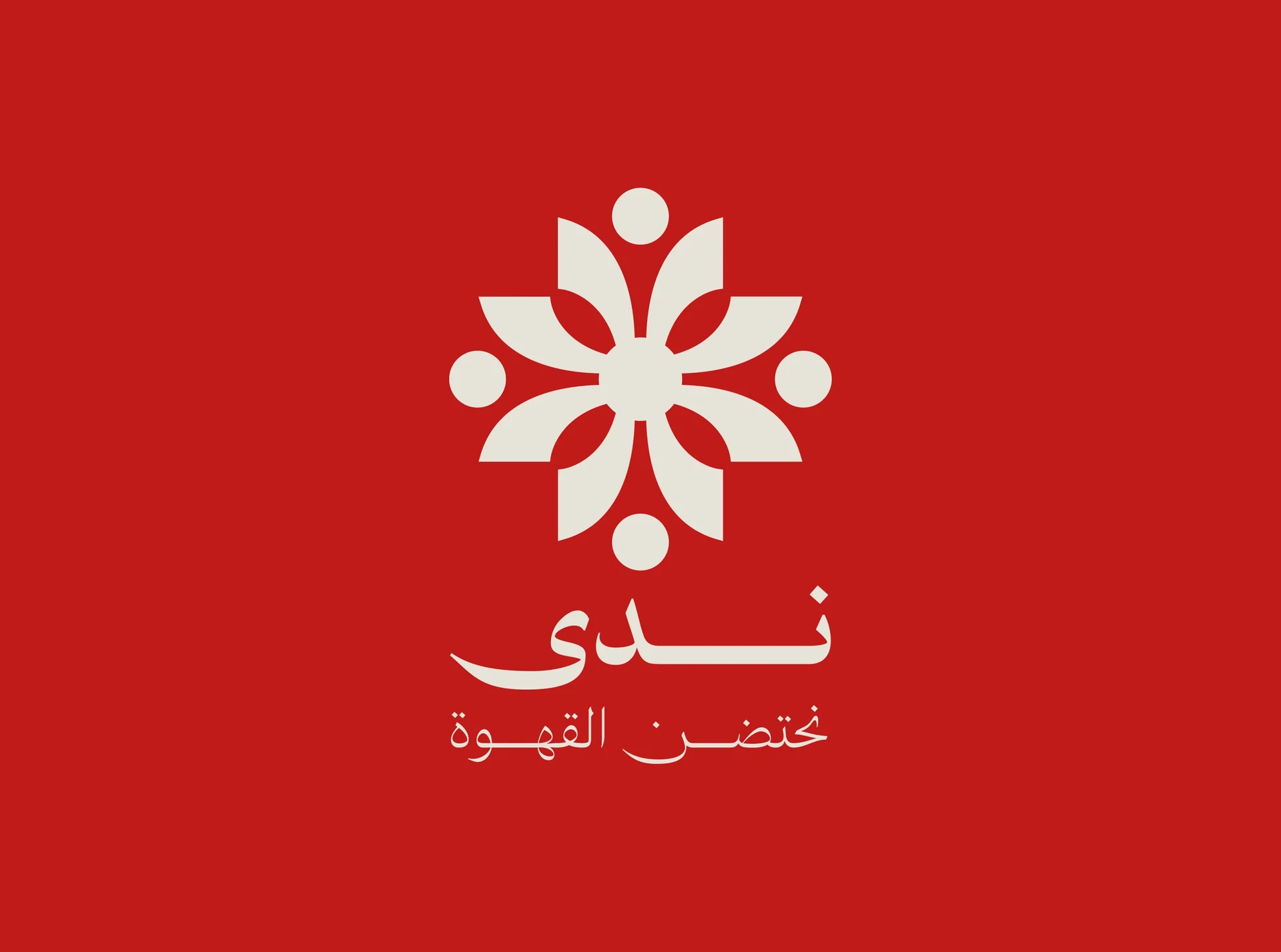
Nada pairs a soft Arabic wordmark with a geometric floral symbol. In addition, the symbol adds a second visual asset that can work on packaging or an avatar. Notice how the shared colour keeps the two parts together. If you choose this route, test the wordmark and symbol both together and separately.
13. Centro: balance both scripts in one lockup
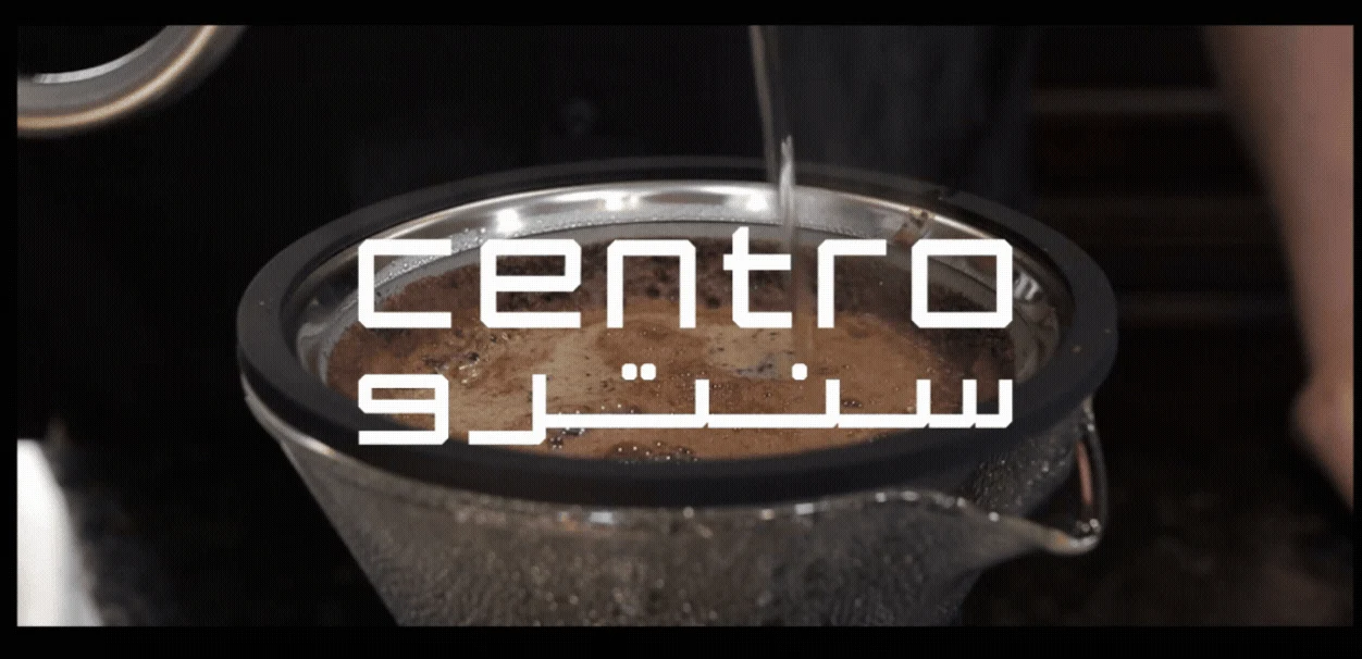
Centro presents its English and Arabic lettering as a compact paired lockup. As a result, the two lines create a clear block that works against a dark photograph. Use this reference to review hierarchy. Decide which language customers should notice first, then adjust scale and spacing so the secondary name remains useful.
14. BLANCO: consider the shape of the packaging
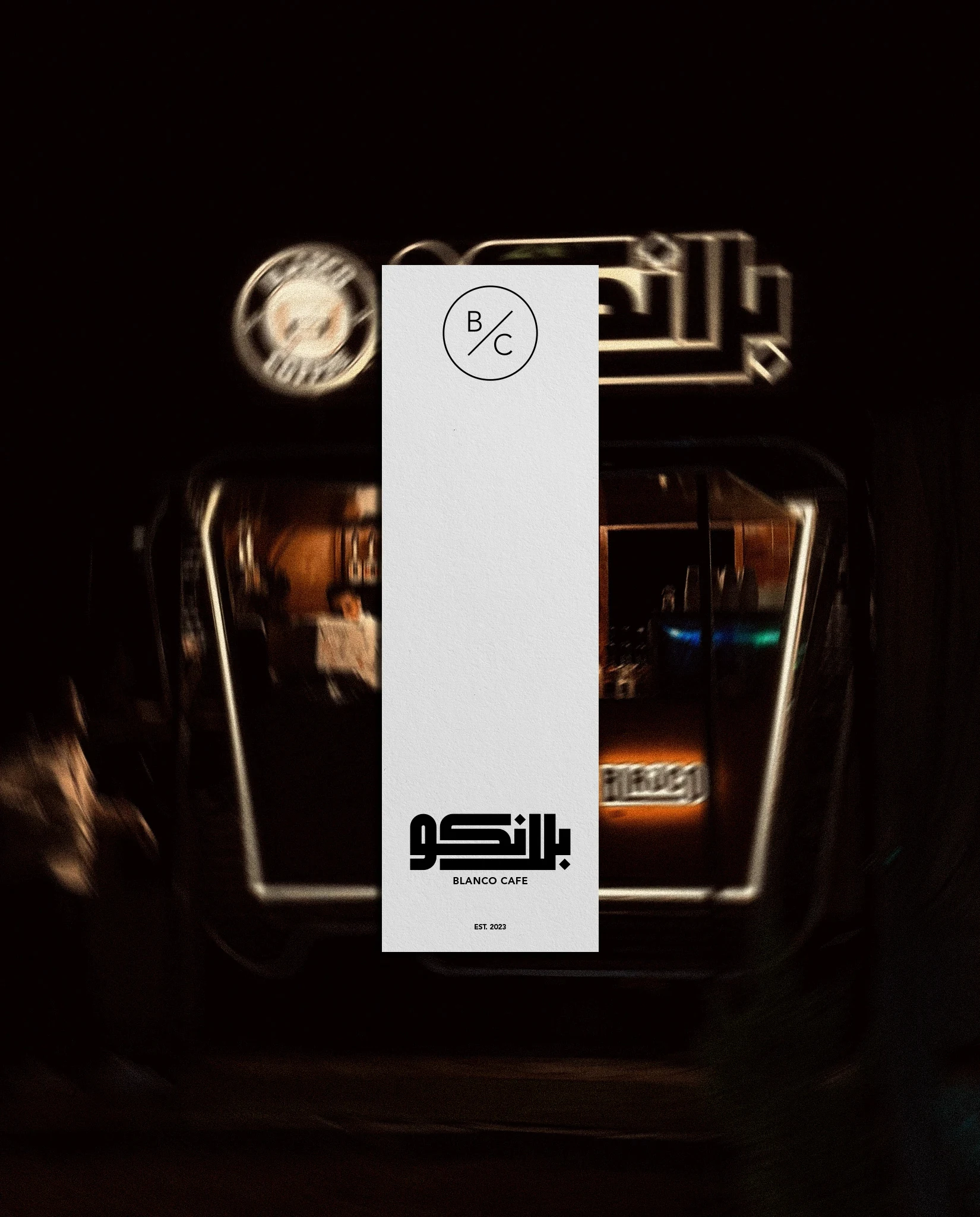
BLANCO places its identity on a tall, narrow label within a dark product scene. In particular, the format draws attention to vertical spacing and placement. Packaging constraints should enter the brief early. A beautiful wide logo may need a stacked version for a slim label, while a compact mark can offer more flexibility.
15. Arabic Coffee: let calligraphy become the main image
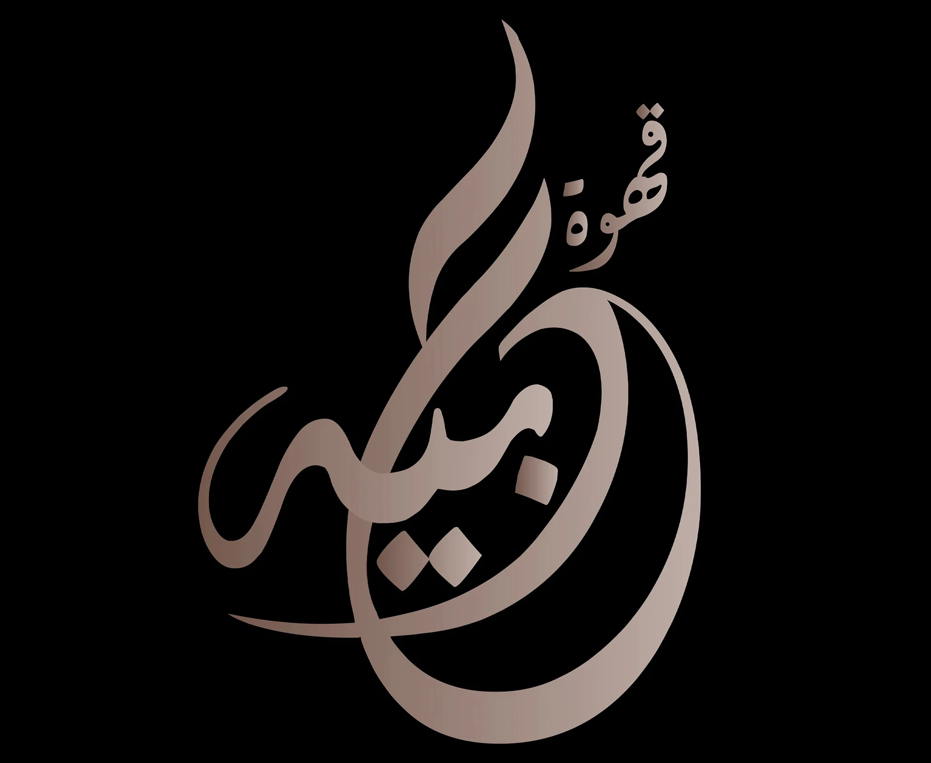
This reference gives flowing Arabic calligraphy the entire stage. As a result, the restrained background keeps attention on its silhouette, curves and internal spaces. It is a useful direction for an expressive identity. Still, decorative beauty should not replace language checks. Ask an Arabic reader to confirm the name before judging the final presentation.
16. AKEF: test a tactile finish
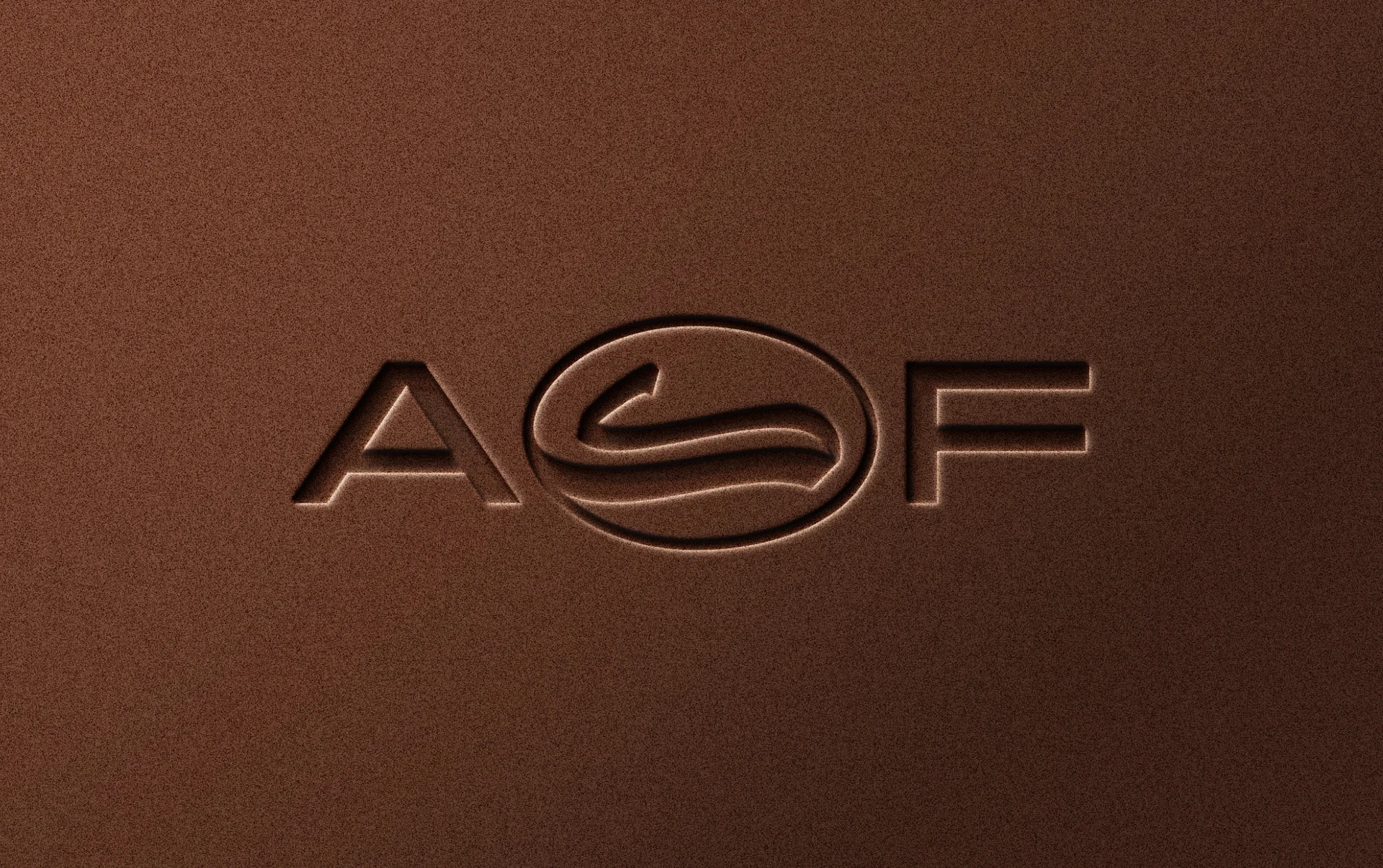
AKEF presents its mark as an embossed finish on a brown surface. This treatment shows how a logo can work through depth and shadow, rather than colour alone. For Arabic cafe logo design, include a one-colour production test. Request the same artwork in flat black before approving an impressive mockup.
17. RIHAL: a delicate Arabic cafe logo design
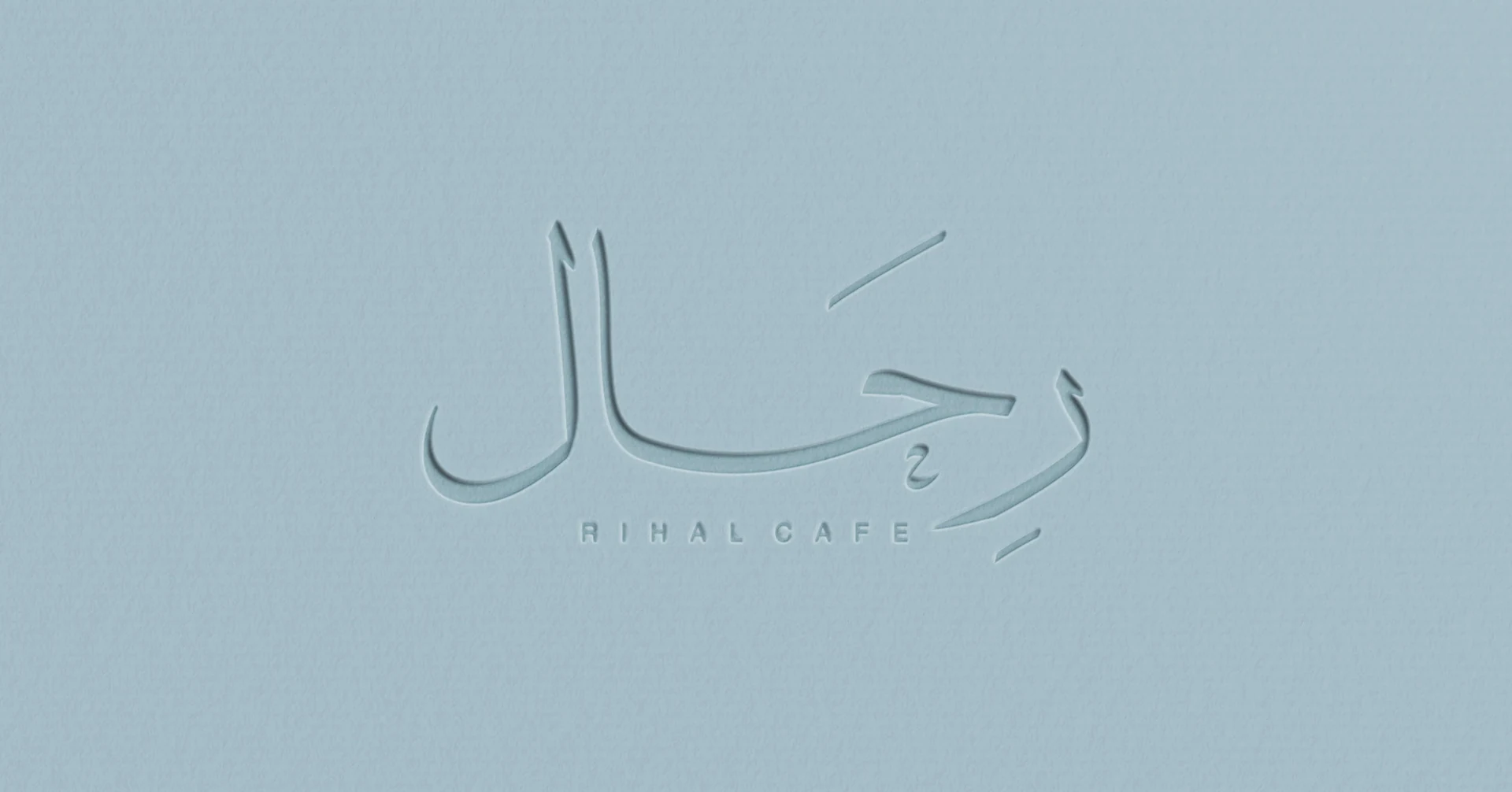
RIHAL uses fine lettering and a pale blue surface to create a light visual mood. In particular, the generous space helps the thin strokes remain visible. This approach needs careful reproduction checks. Test the smallest intended size and review contrast on actual materials, especially when the final sign or packaging uses a subtle finish.
18. Baz: shape the letters into a recognisable composition
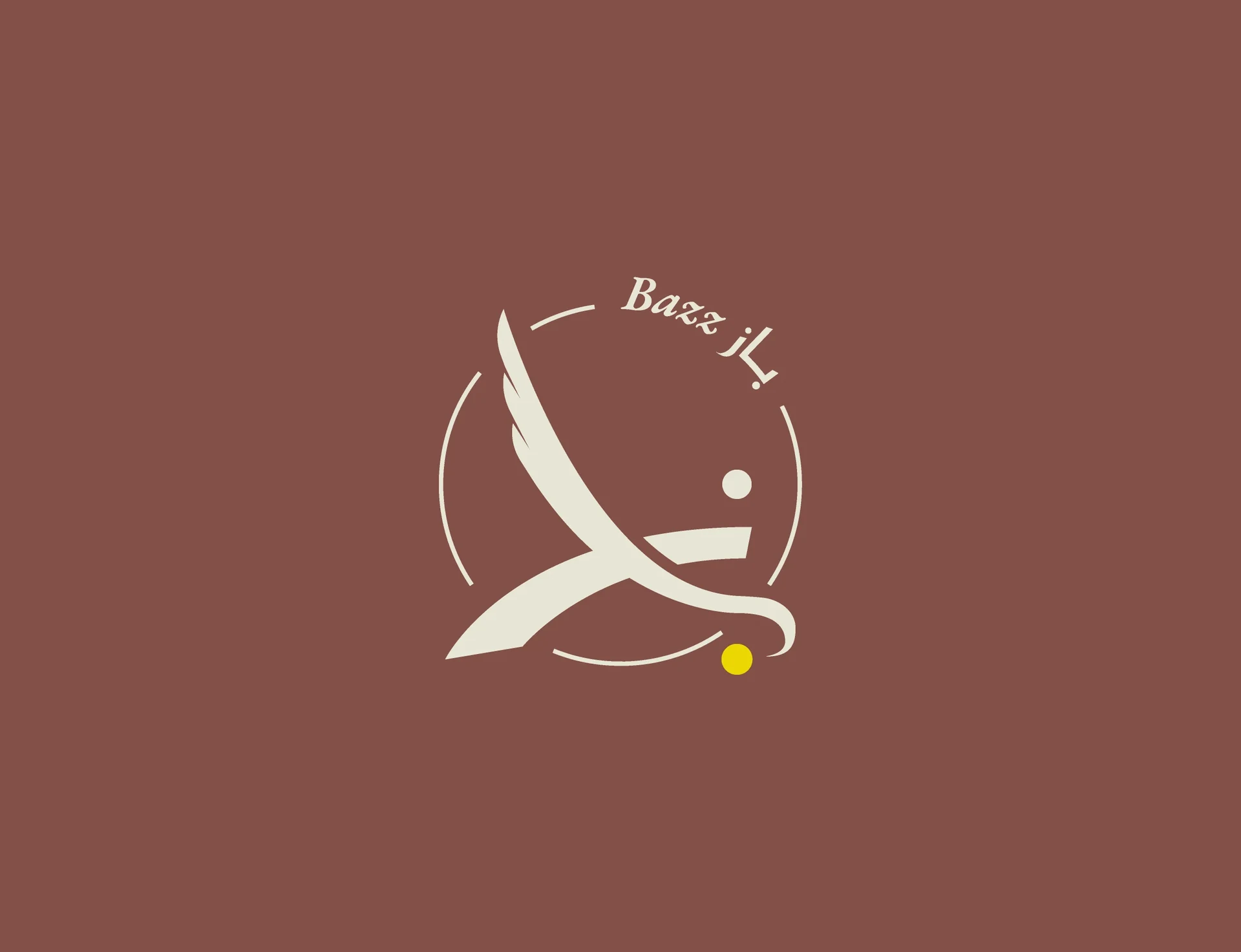
Baz arranges its lettering into a distinctive composition, with small yellow accents adding emphasis. In particular, the example shows how a wordmark can behave like a symbol. When exploring a similar idea, preserve the reading order. Then check whether the dots and accents remain clear after you reduce the artwork.
19. Awj: Arabic cafe logo design with a graphic pattern
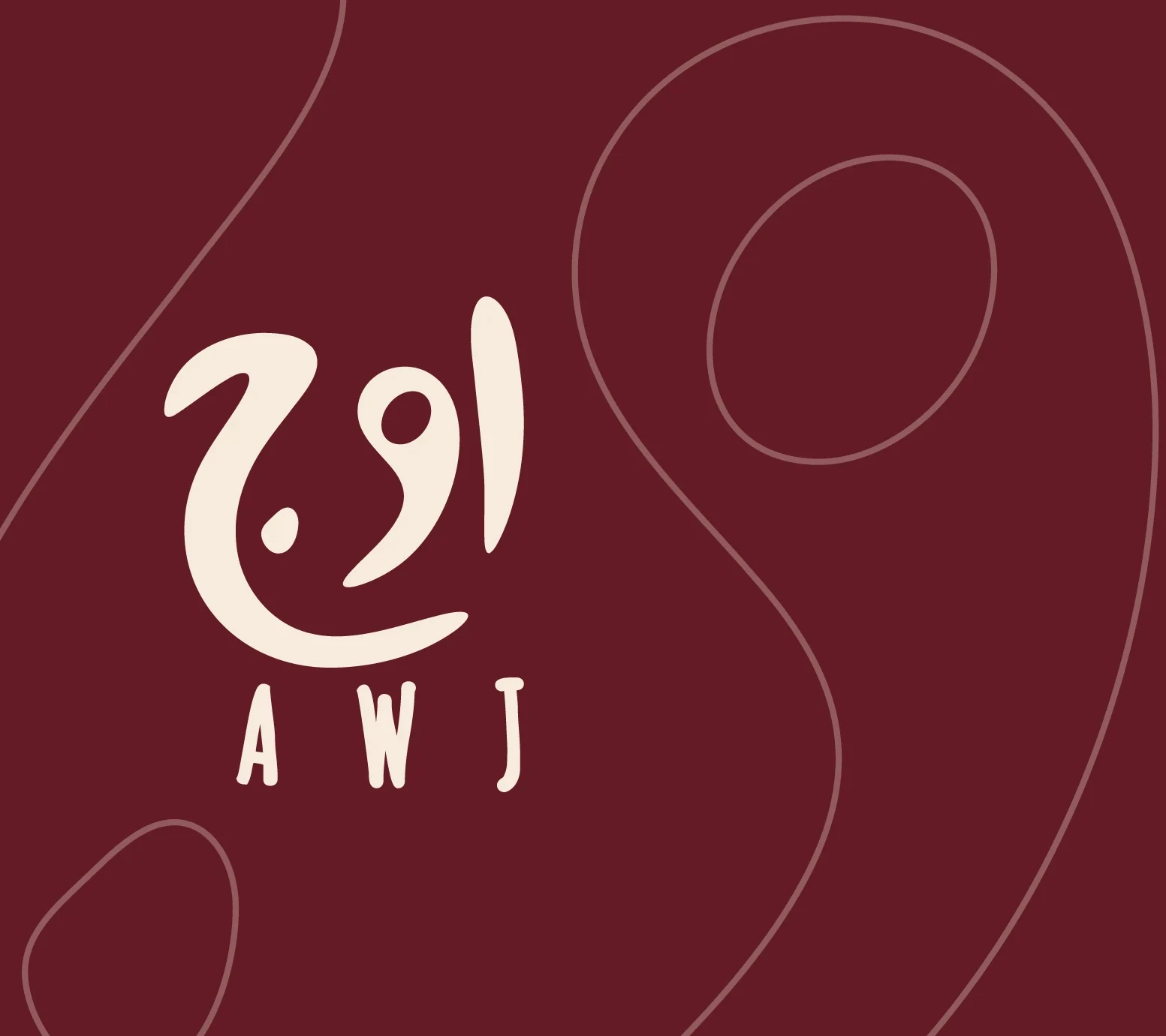
Awj gives the Arabic name a central role, supported by smaller English lettering and line-based graphics. In addition, the surrounding pattern extends the identity without replacing the wordmark. This is a useful distinction: the logo should identify the café, while supporting graphics can add texture, movement and variety across larger applications.
20. Heen: explore a theatrical presentation
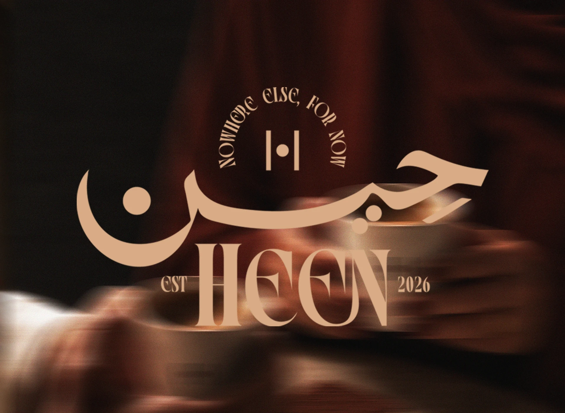
Heen uses gold-toned lettering, dark surroundings and a dimensional presentation. As a result, the presentation offers a strong reference for a dramatic brand mood. When evaluating a luxury direction, separate the actual mark from the lighting effects. A good identity should still feel convincing in a simple menu header or a one-colour print.
21. Adeem: consider the coffee bag as a brand canvas
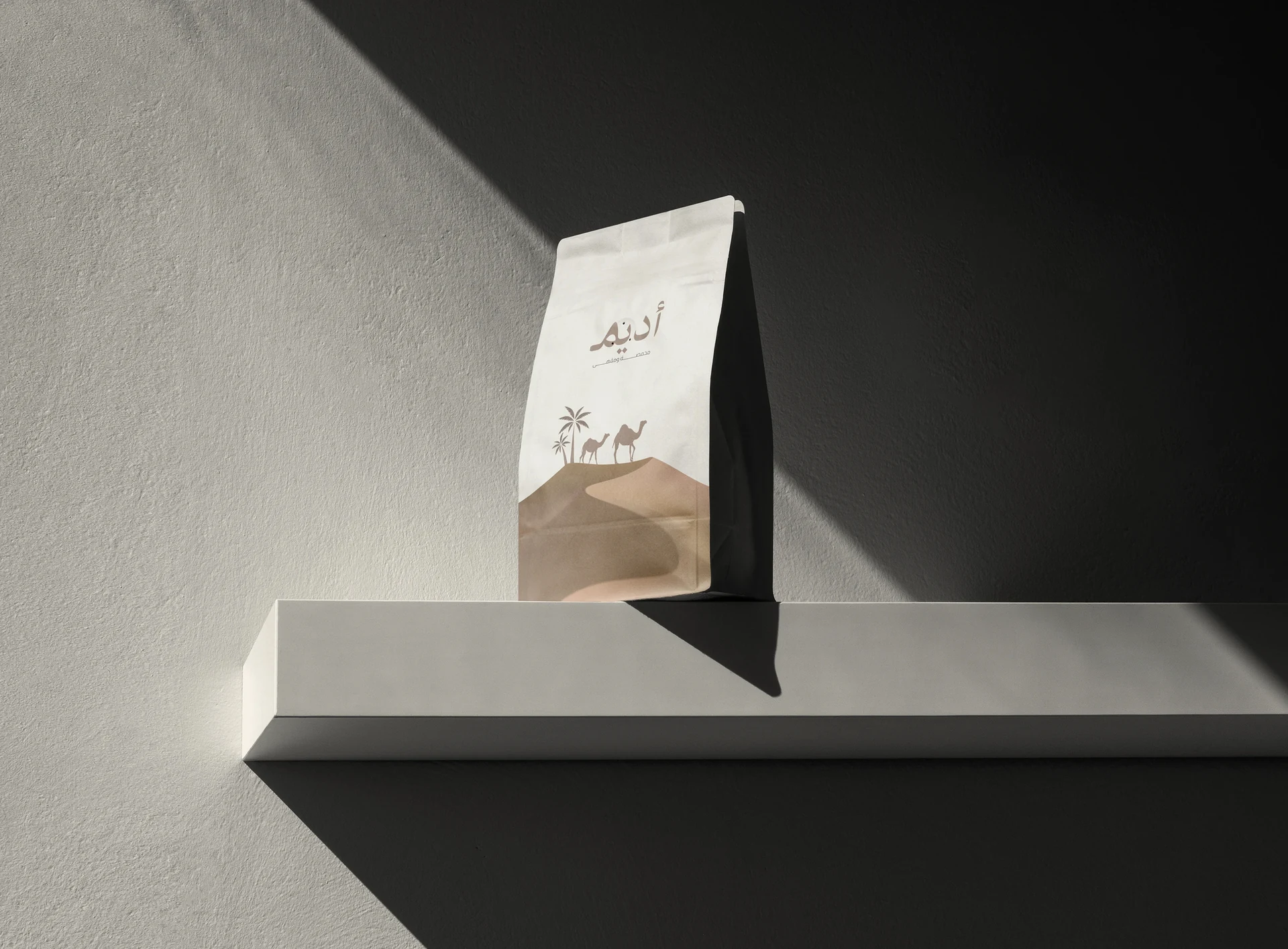
Adeem presents a coffee bag within a quiet, architectural scene. In particular, the large areas of negative space let the package become the focal point. For a café that also sells beans, the retail bag deserves attention early. Review how the name, product details and logo share the front panel at normal viewing distance.
22. Rahi: connect packaging to a wider visual language
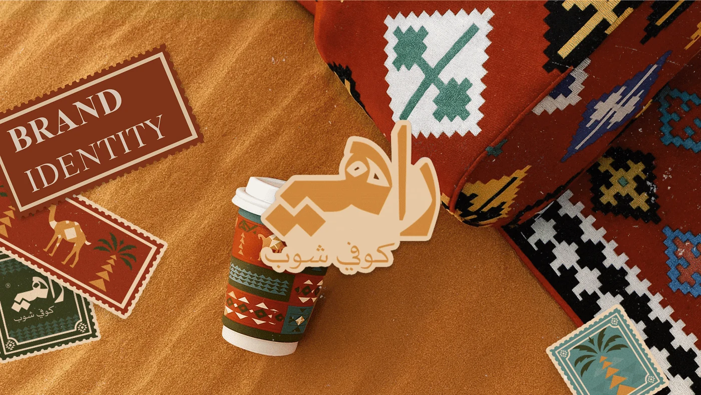
Rahi places its cup within a colourful setting of textiles and graphic elements. As a result, the identity extends beyond a single isolated mark. Use it to think about how local references can shape a complete brand. Choose details that connect to your café story, then simplify them enough for consistent packaging and print.
23. Hayyiz: Arabic cafe logo design on coffee cups
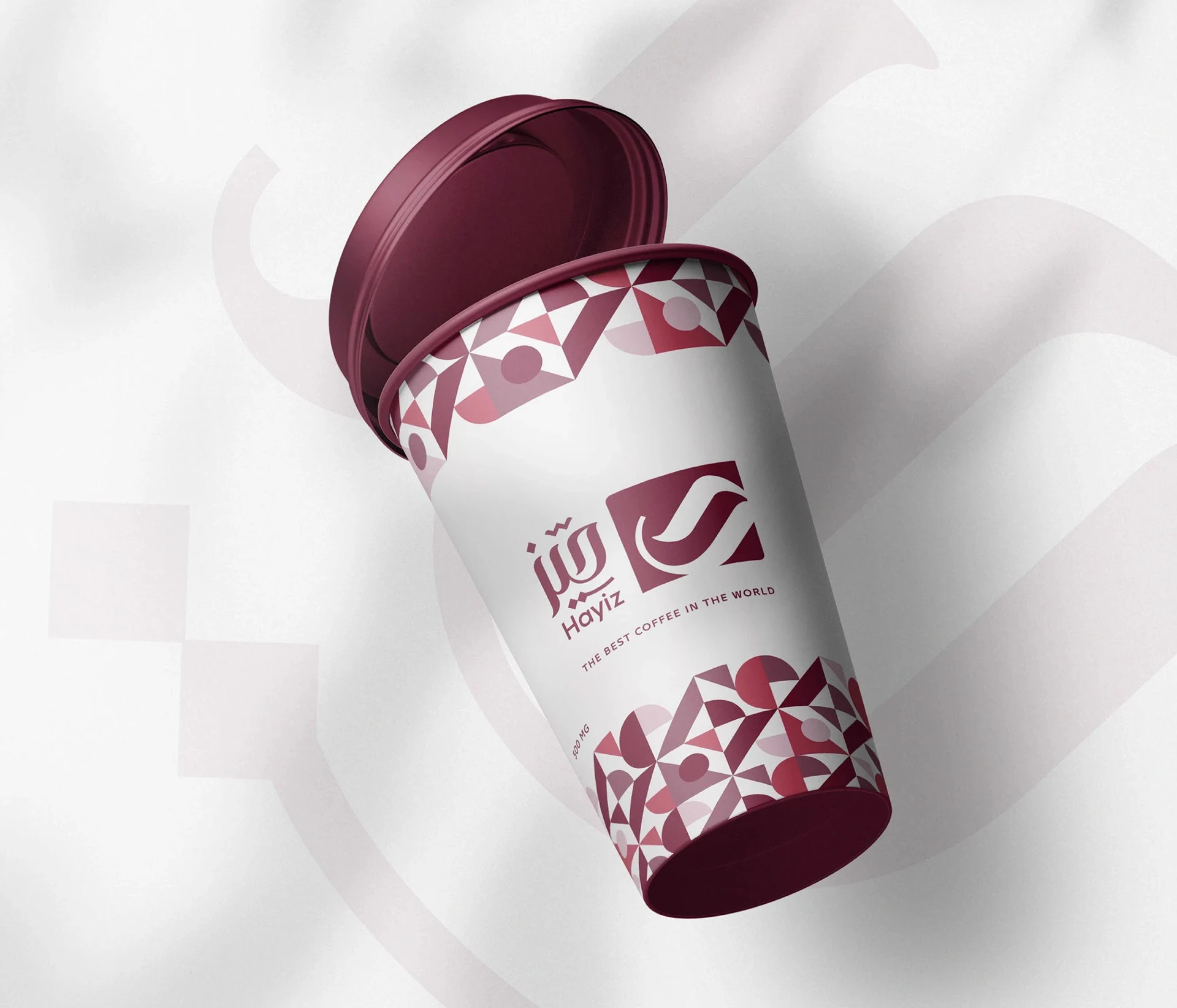
Hayyiz uses a white cup, burgundy lettering and a patterned band. In particular, the layout shows why a cup should be part of the design process. Rotate your mockup and inspect the seam, sleeve and lid. Also test the mark where fingers cover part of the surface, rather than judging only the ideal front view.
24. Shalla: allow the brand to be playful
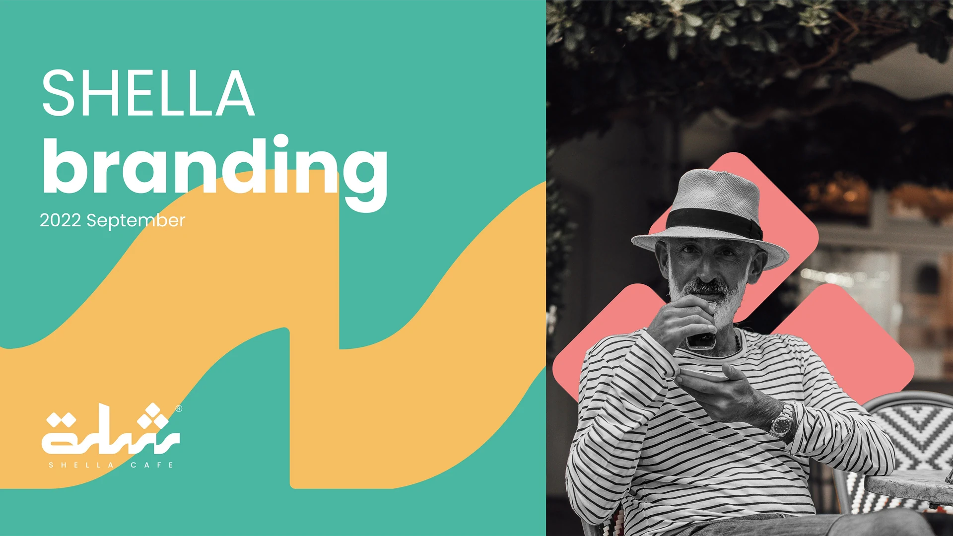
Shalla uses bright colour, large graphic shapes and a playful presentation. It provides a different direction from the dark green and gold often seen in heritage-inspired coffee branding. If your café feels lively and social, reflect that in the visual brief. Then keep a consistent colour and type system across the fun.
25. Aden: turn Arabic lettering into architectural signage
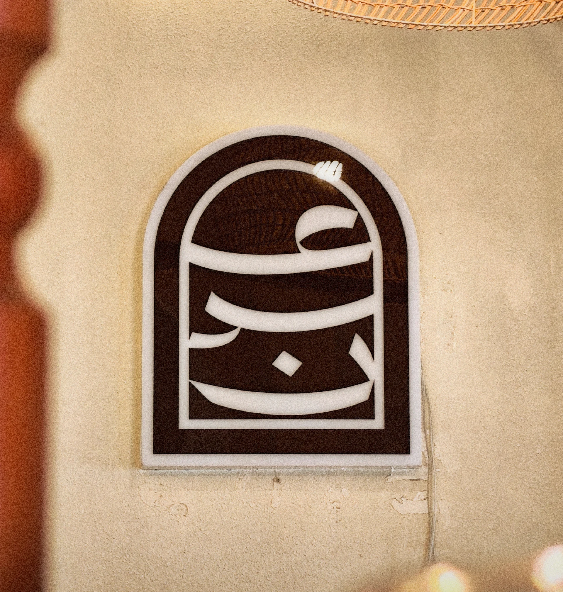
Aden presents its lettering within a tall, arched sign. The sign shape and letter composition create a single focal point. This approach works best when the architecture informs the brief from the start. Before refining the logo, measure the available sign area and check how people will approach the entrance.
26. Q Coffee: build a focused visual research board
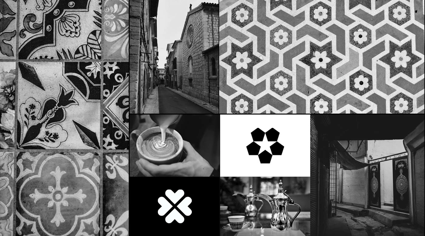
This Q Coffee reference is a visual research board, rather than a standalone Arabic wordmark. It earns its place here by showing how texture, geometry and atmosphere can guide a branding project. Keep your own research focused. Select references for a clear reason, then explain what each one contributes to the brief.
27. Oflet: develop a useful secondary mark
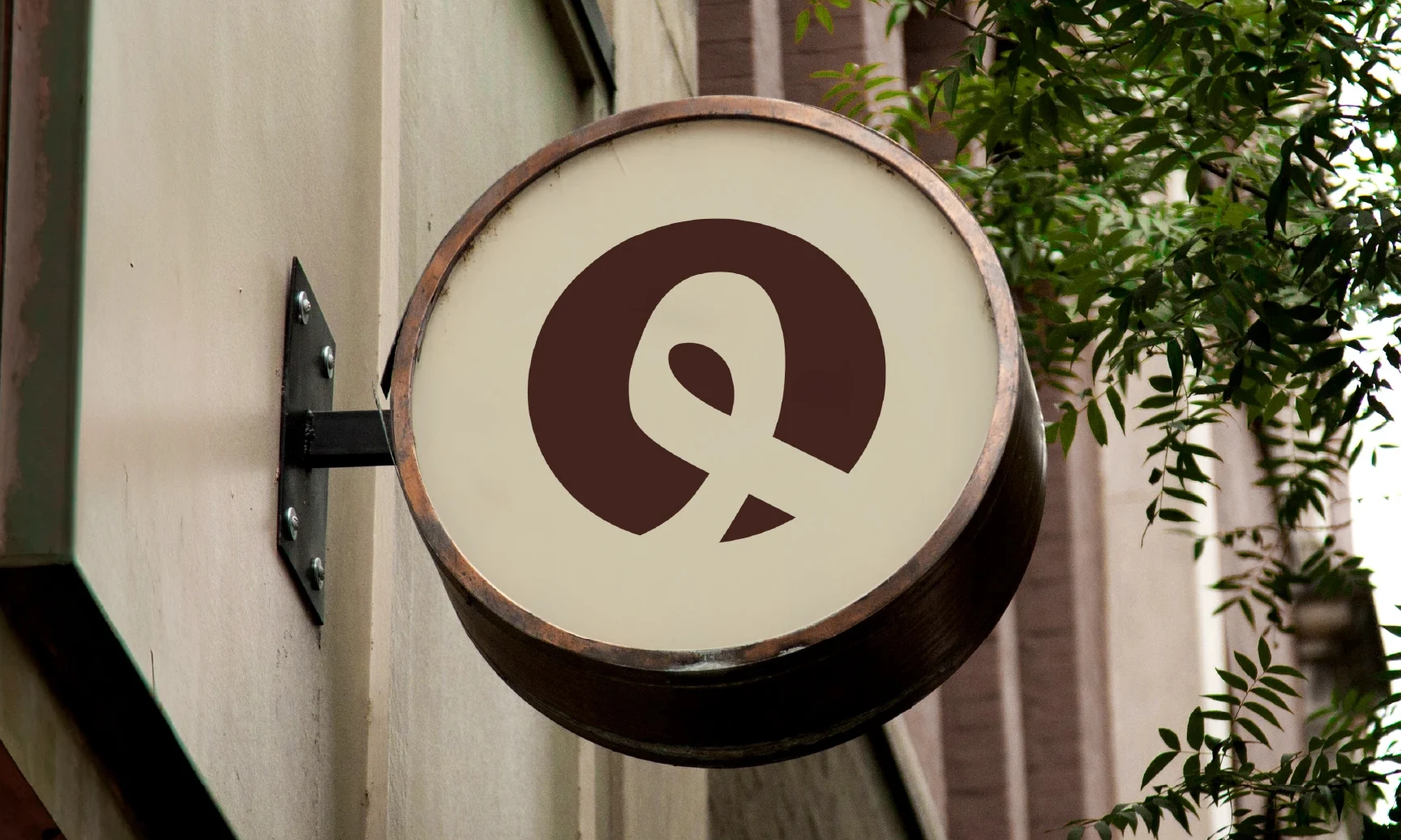
Oflet uses a bold symbol on a circular projecting sign. The simple composition is easy to identify within the street scene. It is a helpful reference for secondary marks. A café may need both a full name and a compact symbol, especially for avatars, small labels and signs viewed at an angle.
28. Diwan: bilingual Arabic cafe logo design
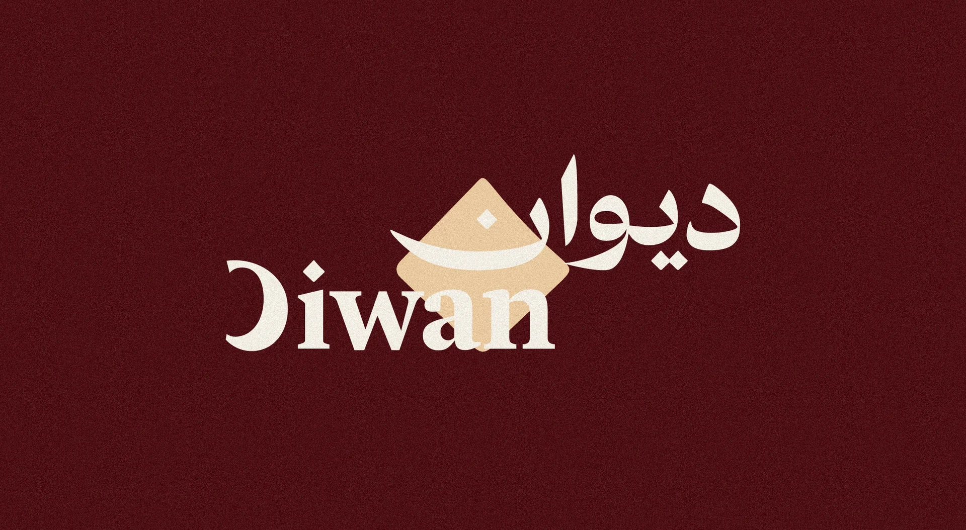
Diwan places its Arabic and English names together on a burgundy background. The warm palette and shared arrangement link the scripts. When comparing bilingual logo ideas, judge the pair as a complete composition. Neither line should look like an afterthought, even when one language takes a stronger role.
29. Mazaq: create contrast with a quiet palette
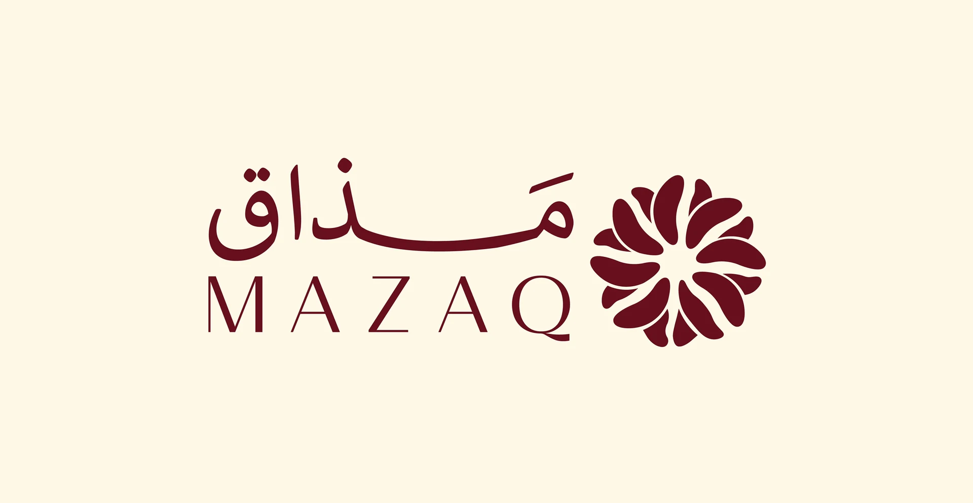
Mazaq uses burgundy lettering and a compact symbol against cream. The contrast gives the identity presence without a busy background. This is a useful Arabic cafe logo design direction for brands that want warmth and restraint. Test the palette on your chosen paper and cup stock, since material colour affects the result.
30. Zayan: fit the wordmark to the storefront
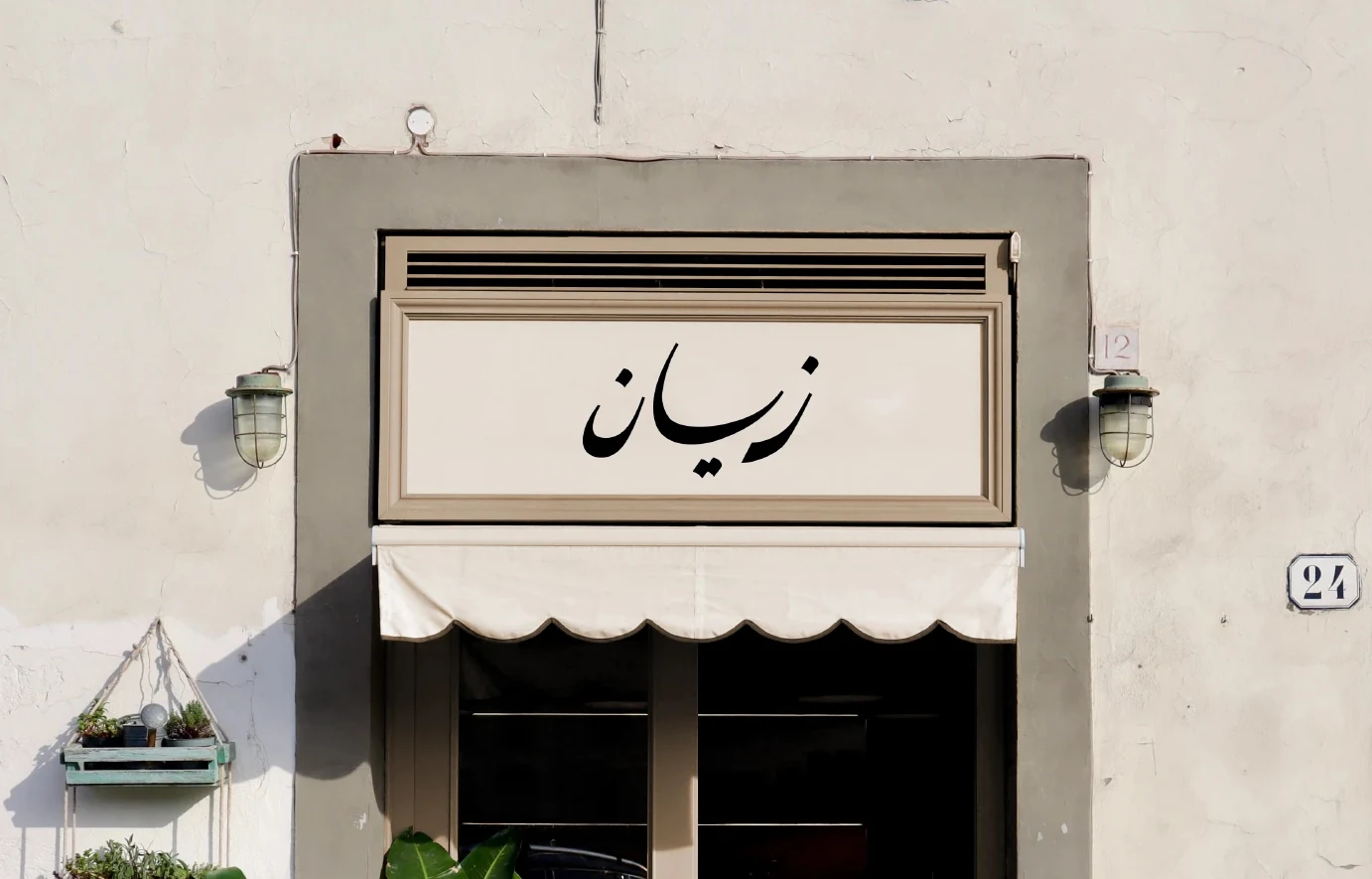
Zayan shows a simple wordmark on a calm storefront. Its restrained placement lets the building and lettering support each other. Use this example when deciding how much detail a sign really needs. Photograph your own frontage, place several options at scale and compare them from the same viewing distance.
31. Kaffa: clear Arabic cafe logo design hierarchy
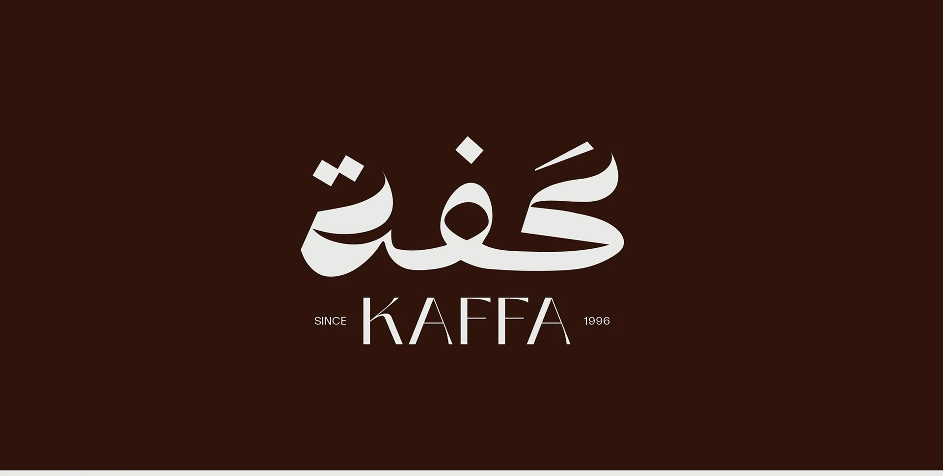
Kaffa puts the Arabic wordmark first and the English name underneath. The dark background creates strong contrast with the cream lettering. This clear hierarchy is useful when a café needs a straightforward identity. Check the wordmark at menu size, then confirm that the smaller line remains readable where you intend to use it.
32. Nina Café: review the complete brand family
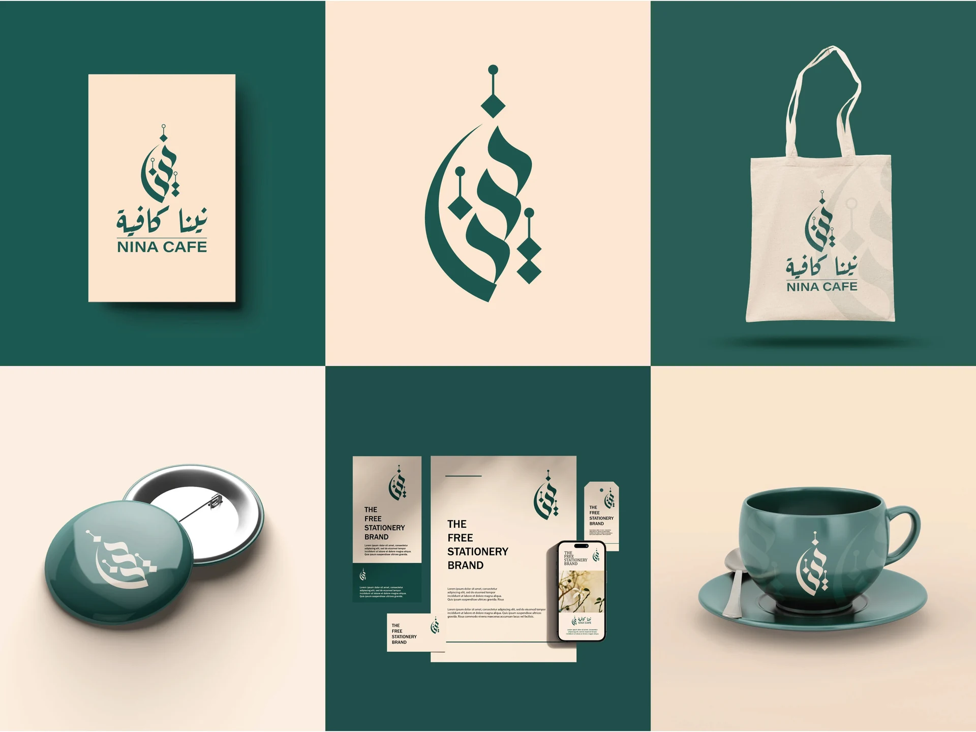
Nina Café shows the mark alongside cups, a bag and printed materials. Seeing the applications together makes consistency easier to judge. Use this as a final review method for your own project. Place the sign, menu, packaging and social avatar on one board, then remove anything that feels like a different brand.
How to turn Arabic cafe logo design inspiration into your own identity
1. Define the café before choosing a style
Write a short brief that covers the name, location, menu, audience and atmosphere. Include the confirmed Arabic spelling and the English version, if needed. Next, explain how you want customers to describe the café. Three specific words, such as calm, social and crafted, are more useful than a long list of broad claims.
2. Build a small, purposeful shortlist
Choose three to five references for different reasons. For instance, one may show the right letter weight, another may solve bilingual hierarchy, and a third may handle packaging well. This keeps your Arabic cafe logo design brief focused. It also helps the designer create an original response rather than imitate one example.
3. Check Arabic lettering before approving the concept
Ask a fluent Arabic reader to review the exact name, letter connections, dots and reading order. If the name needs vowel marks to avoid ambiguity, discuss that early. Then review a plain black version. A dramatic mockup should never hide a spelling problem or a weak silhouette.
4. Test realistic sizes and materials
Print the artwork at the actual size of your smallest label. Place it on your cup template and check the curve and seam. Then view the storefront design from a distance. If you plan to use foil, embroidery or engraving, ask the supplier to confirm its minimum line and gap requirements.
5. Request a complete, usable handover
Ask for vector artwork, transparent image exports, colour values and basic usage rules. Include the main logo, a small-size version and any approved bilingual lockups. Also confirm the usage rights for fonts and supporting artwork. A clear handover makes future menus, packaging and signage easier to produce consistently.
Common Arabic cafe logo design mistakes to avoid
- Distorting the letters: A clever shape is not useful if it changes the name or makes it hard to read.
- Adding every coffee symbol: Choose one clear idea instead of stacking unrelated icons.
- Ignoring small sizes: Fine strokes and tight spaces may disappear on a stamp or label.
- Letting English dominate by accident: Set the language hierarchy deliberately.
- Approving only a mockup: Review the flat artwork and a one-colour test as well.
- Copying a reference: Use the design principle as inspiration and develop your own composition.
Arabic cafe logo design checklist
Before signing off, make sure you can answer yes to these questions:
- Is the Arabic name correct and readable?
- Does the design fit the café’s audience and atmosphere?
- Does the mark remain clear in one colour?
- Have you tested cups, menus, signage and a small social avatar?
- Do the Arabic and English versions feel related?
- Have you received the final vector files and agreed usage rights?
Frequently asked questions
What is the best style for an Arabic café logo?
The best style depends on the café’s name, audience and experience. Calligraphy can suit an expressive brief, while a simple wordmark may work better for a restrained identity. Compare each option on real applications before you choose.
Should a café logo include both Arabic and English?
Use both languages when they help your customers recognise and remember the name. Start with a clear primary version, then create alternate lockups where needed. Avoid shrinking one script until it becomes decorative text that nobody can read.
Can I use these Arabic cafe logo design examples for my business?
Use the examples to research visual directions, not as ready-made business logos. The original artwork belongs to its creators. Commission an original identity or arrange a suitable licence directly with the rights holder.
Which files should I request from my logo designer?
Request vector files such as SVG or an appropriate print-ready PDF, plus transparent PNG exports. Include approved colour and one-colour versions. Your suppliers may also request a specific file format, so confirm their requirements before production.
How much does an Arabic café identity cost?
Cost depends on the scope, lettering work, revisions and number of applications. A custom logo alone is a different project from a full identity with menus, packaging and signage. Ask for a written scope and quote so you can compare equivalent deliverables.
Build a café identity with a name people remember
The strongest Arabic cafe logo design starts with a clear name and a clear brief. Use these examples to compare approaches, then test your chosen direction in the real world. Beautiful lettering matters, but clarity, consistency and practical use make the identity work every day.
For more references, explore our Arabic calligraphy logo collection and Arabic branding examples for Saudi businesses.
Planning your own café brand? I’m M. Aswad Mehtab, an Arabic logo and branding designer. Share your café name, location and the direction you have in mind. Explore my Arabic logo design service, message me on WhatsApp, or view more work on Instagram.