Color & Fonts Driving World’s Best Logo Designs and Branding.
Businesses understand the importance of branding and corporate logos. These designs are often what consumers think of when they think of the business, and it is the dream of any business owner to have their logo become a common symbol.
Becoming a recognizable symbol takes more than luck; it takes careful planning and creativity. It consists of using the right symbols, colors and even fonts to make the logo appealing. It also consists of knowing that simple logos are often the most memorable.
In an effort to help businesses create a more effective logo, research has been conducted on the top 100 most recognizable logos to determine what makes them so popular. The information can help any logo designer select the right factors to create a memorable logo.
Study & designed by Tastyplacement.com/
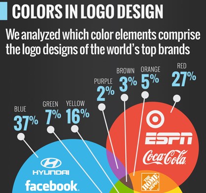
Colors
When it comes to color, most prominent logos are very basic. Relying on a single color, or possibly two, avoiding elaborate colors in logos seems to be the most effective. Of all the colors, Blue is most often used coming in at 37 percent of all the top logos are created in a shade of blue. Blues is seen as “welcoming” and “calm,” giving people the sense that the business desires their business.
Black and Red are tied for second place at 27 percent. Both of these colors are associated with strength and professionalism. In third place at 16 percent is the color yellow. Yellow is associated with happiness – think McDonald’s.
The least used colors are white at one percent, purple at two percent and brown at three. While these may be appealing colors on their own, they do not seem to make a very memorable impression on consumers.
Fonts
Fonts are very important to a logo design because they give the name of the company its personality. A person associates the way a name is written with the type of business that it portrays. For example, if Ford Motor Company changed its font from the script font that it uses as its logo to a block style font, consumers would view their product in a different manner. In fact, if Ford implemented this change now after using this font for so long, consumers would actually see their products differently.
Sans font is the most commonly used font, registering at 63 percent. This is because this font is very crisp and clean and easy to read. Helvetica comes in second at 21 percent, followed by slab fonts at 12 percent. Script and serif fonts are on the bottom of the list. Script fonts are usually used to portray a very personal logo, such as a family name, or a very up-scale product, such as Rolex.
Symbol – Text – Or Both
Reviewing the top 100 logos, it has been shown that the most memorable logos are shown with text and a simple symbol. Wal Mart, for instance always shows the name of the company and the little star symbol next to the name.
Out of the top 100, 56 percent use the name and symbol format for their logo. Only 37 percent of these companies use the name of their company only. Just si percent of companies use a symbol only to represent their company.
Overall, what is most apparent when reviewing the top 100 logos is that they also follow the “Keep It Simple” rule. Each of these logos is very basic, even when a symbol is incorporated into the logo. There was not one elaborately designed or multi-colored logo in the group. This seems to be the most important factor in logo creation.