
5 Latest & Hottest Mobile UI Design Trends For 2013 And Beyond
Technological advances have influenced us quite significantly. In other words, it has made our lifestyle more convenient than ever. With the growing popularity of portable doohickeys, users are increasingly turning to smartphones, tablets or fablets. This rapid transition has led to the rise of mobile websites and application where they can create and digest content on-the-go.
Nonetheless, when there are users, there tend to be a User Interface (UI). A designer or developer has to have considerable expertise in this area to furnish a best possible User Experience (UX) to their users. This is the reason one needs to be well-versed in the current trends of mobile UI design to refine their skills and keep it up to date.
To make things easy for you, I’ve searched the web to present you with the latest mobile UI design trends or feds that you can maximize in 2013 and beyond.
Skeuomorphism – Encouraging Realism
Popularized by none other than the innovator of smartphones and mobile apps, Apple Inc, skeuomorphic designs involve glossy and real-world elements that make the interface fairly realistic. For example, you can check out the bookshelf in Apple’s Bookstore that looks look pretty real as the texture and effects used in it all represent real-world elements. However, due to the abundance of these designs, IOS competitor, Android, decided to throw something new like a minimalistic yet sleek, Flat Design trend.
Flat Design – Less Realism More Minimalism
Flat design means lack of realistic or 3 dimensional elements that we see abundantly in skeuomorphic designs. The lack of 3d elements in a flat design encourages clarity throughout the content. This growing trend signifies that aesthetics aren’t the only thing in a UI that enhances user experience but it is the content itself that attracts the users. In short, as long as the UI is visually appealing yet the content is minimalistic, you’ll be able to deliver an ideal user experience.
Responsive Design – Consistency Across Varied Platforms
Though the technology is still in its infancy, responsive designs have gained tremendous popularity ever since its inception, around 2012. The technology was first introduced only as an idea by savvy developers but it is now being used throughout the globe. In fact, many giant corporations like Microsoft and Google have also dipped their hands deeper into this realm. Responsive designs are ideal for mobile devices as compared to their slightly different counterparts, mobile web designs. The design presents content consistently across different devices and in an aesthetically compelling manner.
Text Driven Design – More Readability
Due to the limited screen-size of mobile devices, it is not possible to cover all the elements that a conventional web design caters. This is the reason we see text-centric user interfaces these days – be it a web design or an app. Images or heavy visual elements are now being traded with huge chunks of texts but in an appealing manner. Another reason why you must follow this trend is that text based designs take less loading time than their counterparts, which as a result, works best in your favor.
Large Search Box – More Focus On Search Than Features
Search box is a must for every design, especially if the website or app is about finding things, people or places. This is the reason developers are now emphasizing on large search input in mobile UI designs to prioritize the main function of the app or website.
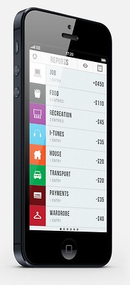
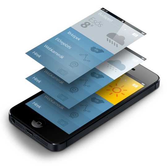
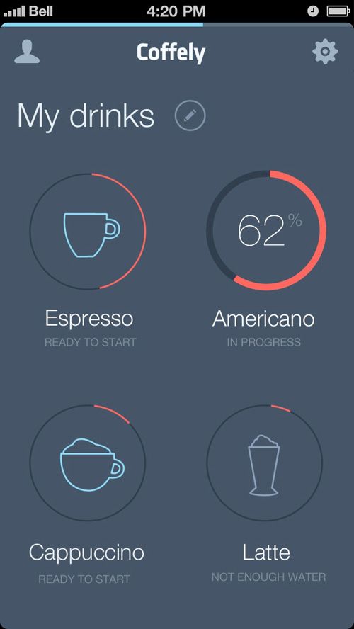
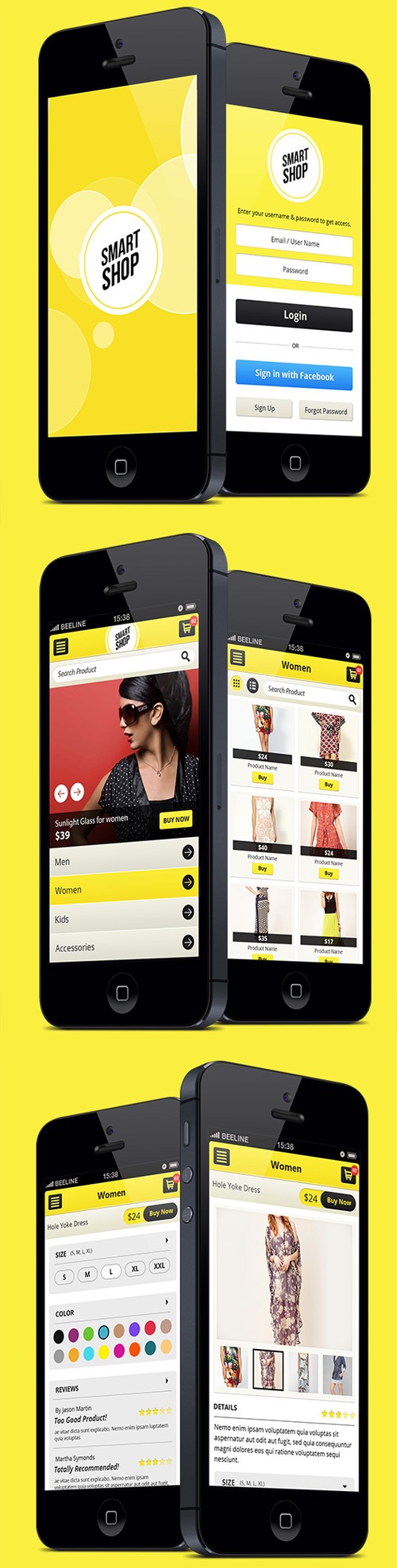
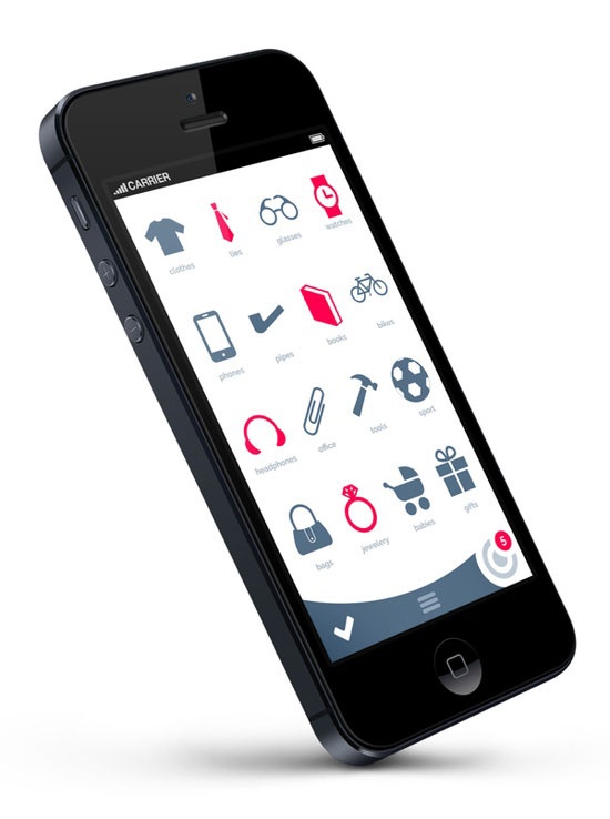
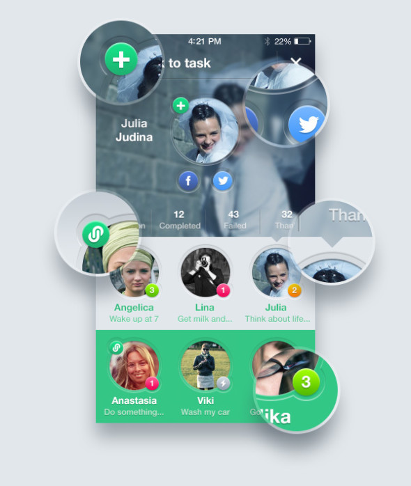
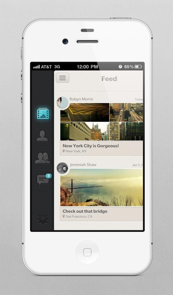
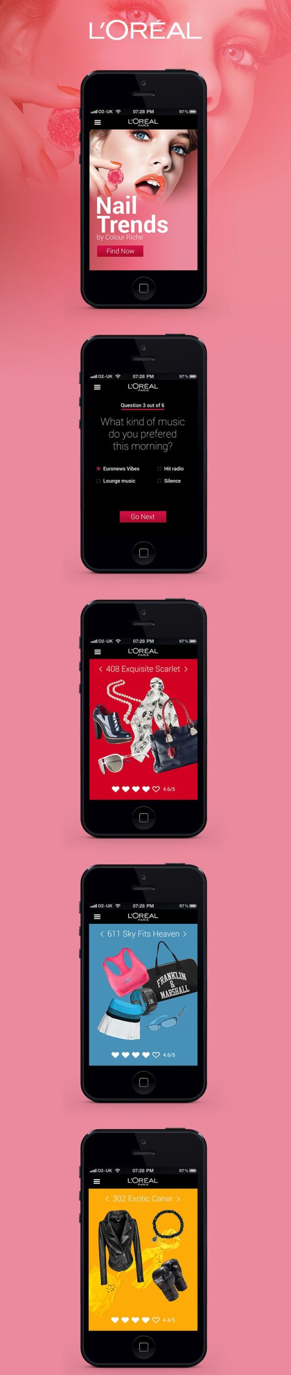
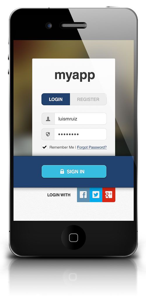
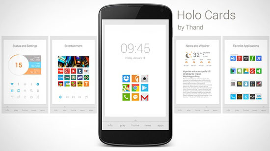
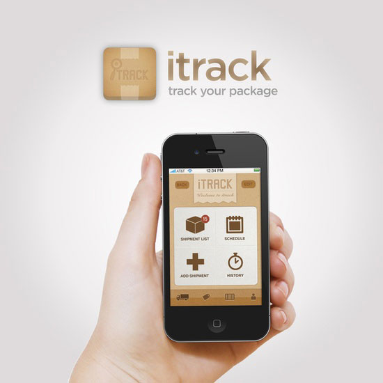
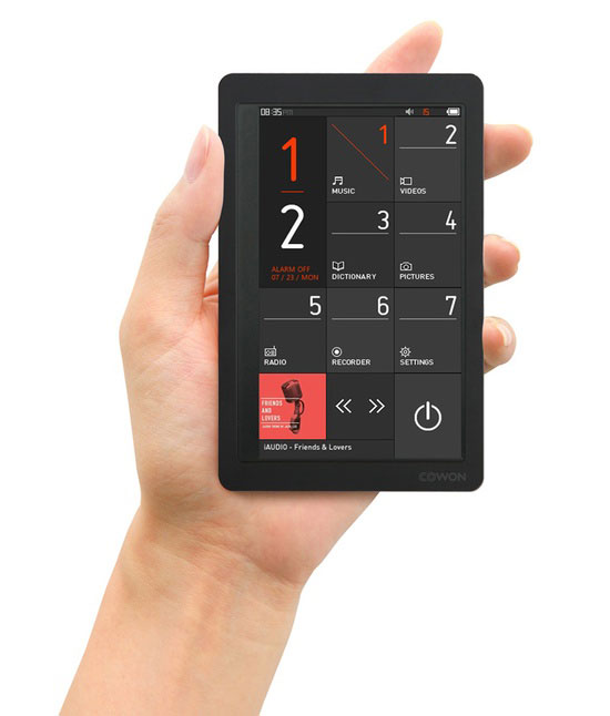
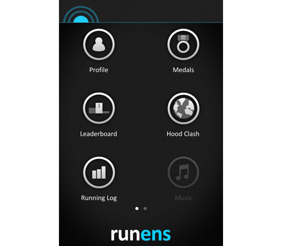
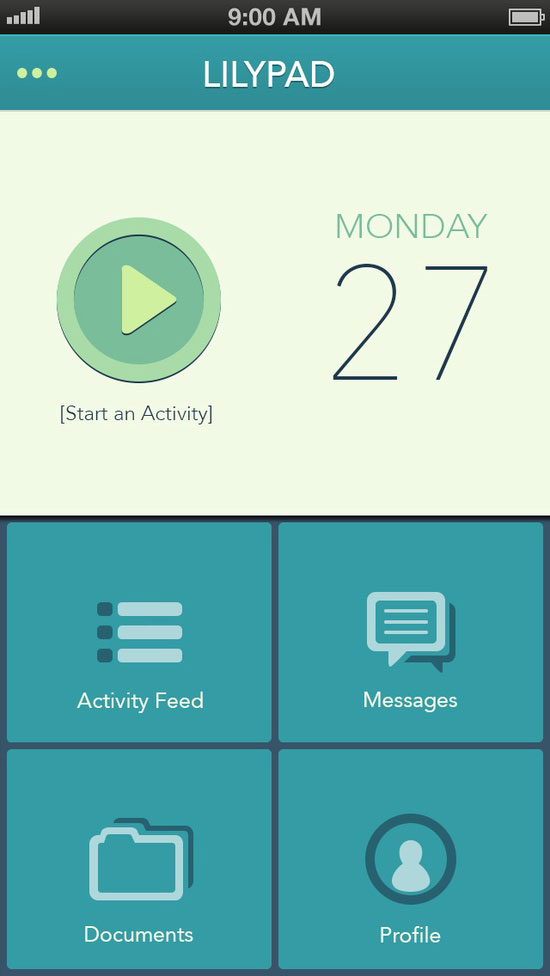
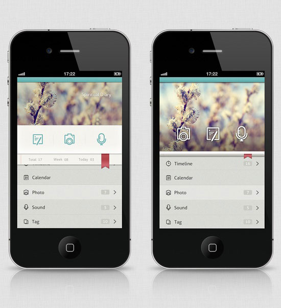
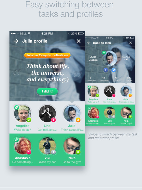
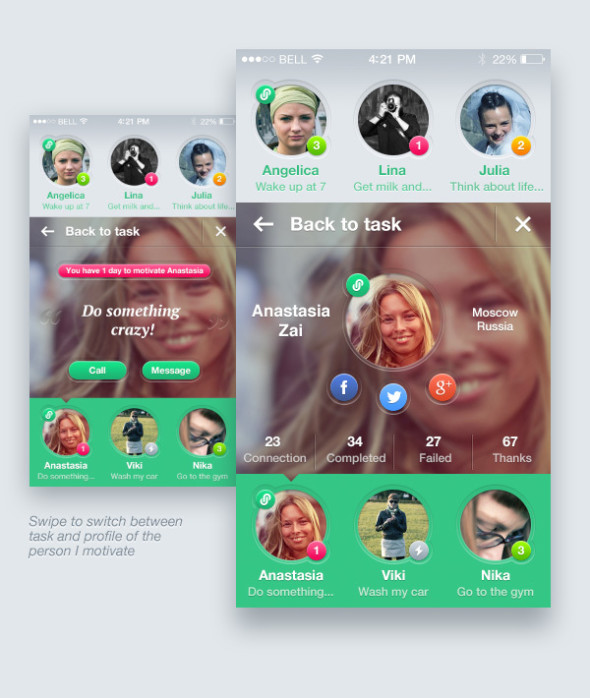
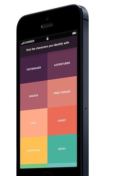
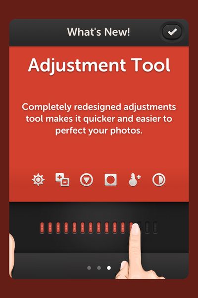
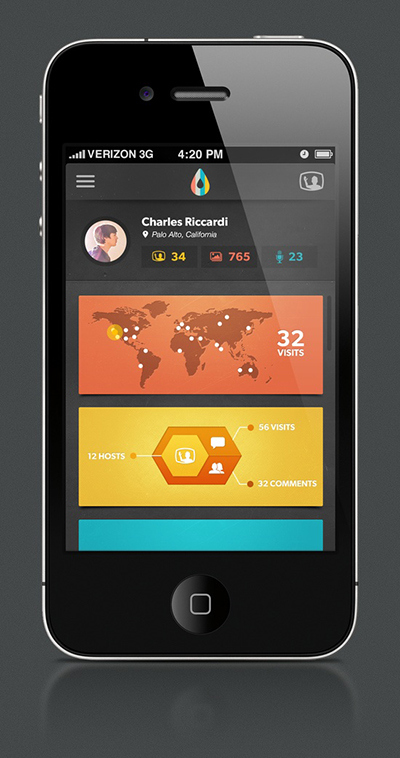
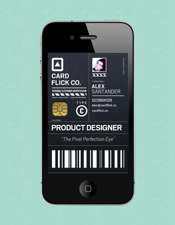
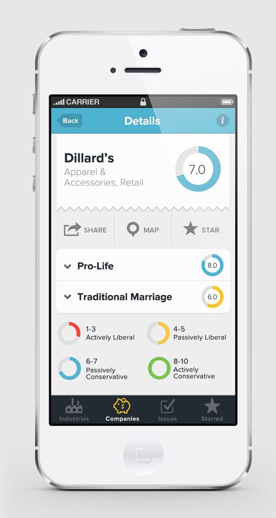
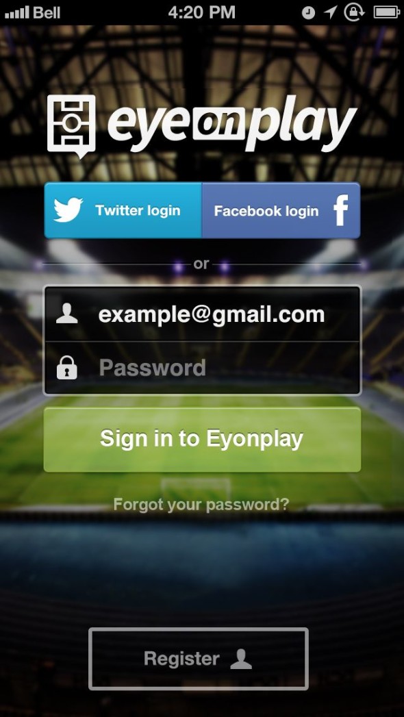
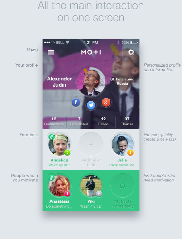
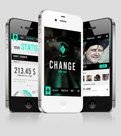
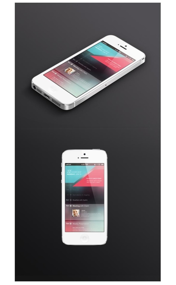
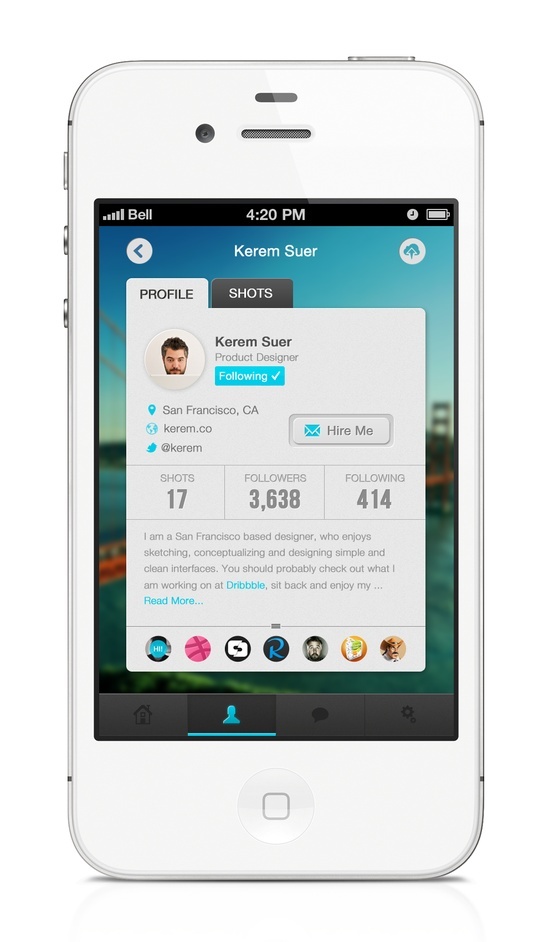
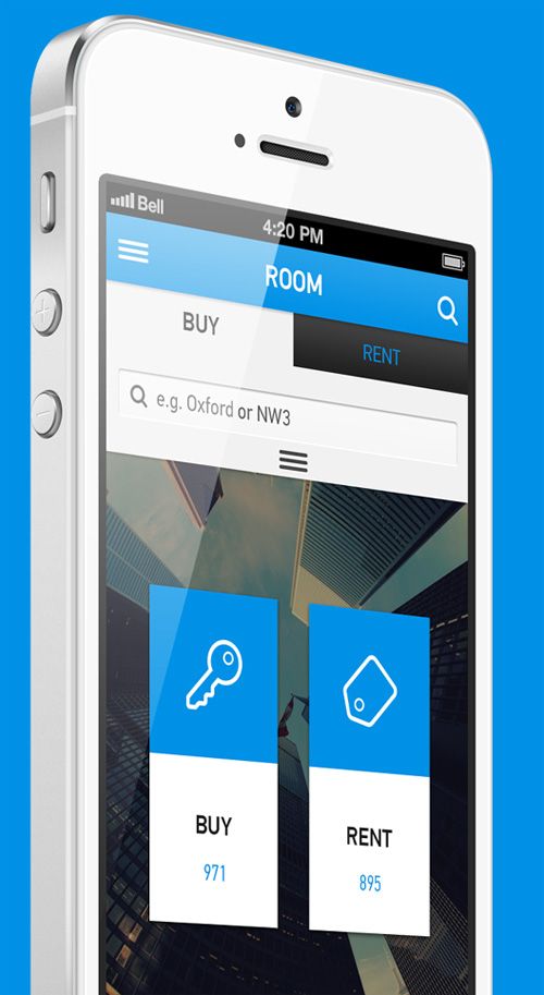
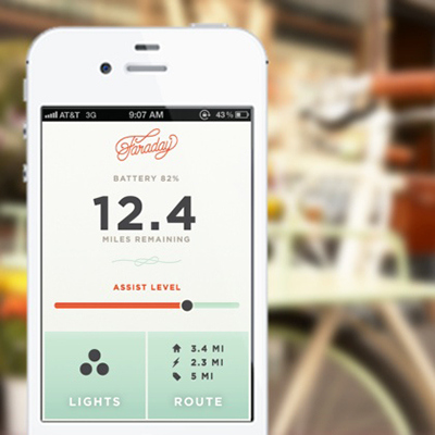
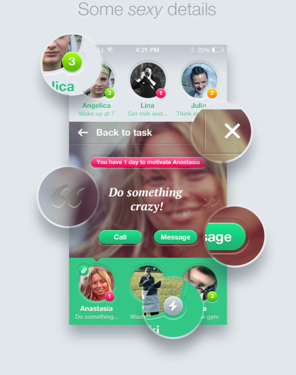
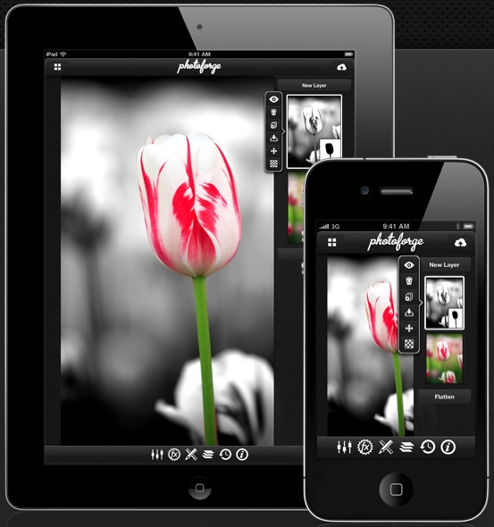
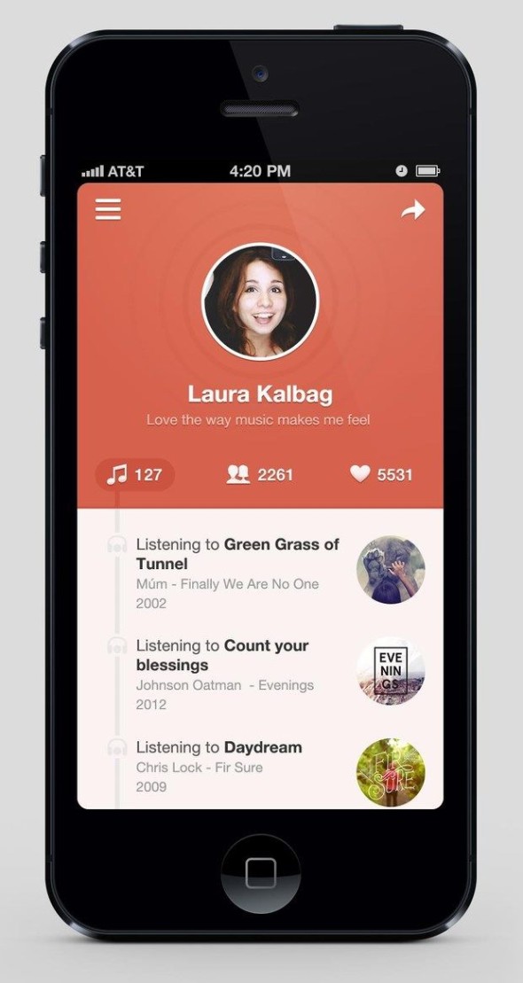
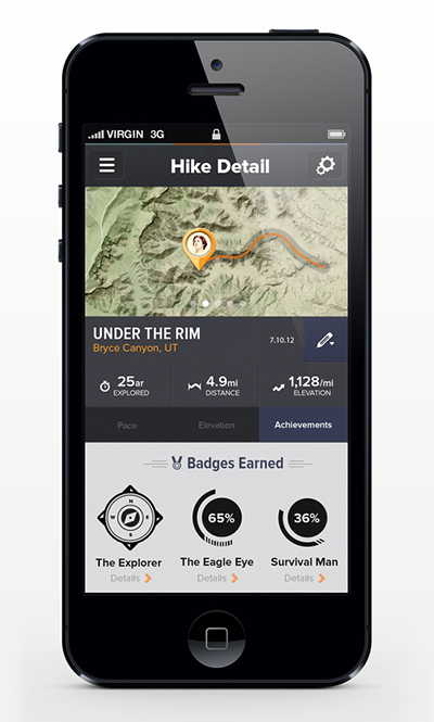
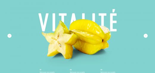
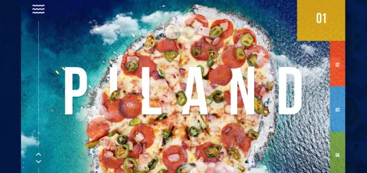
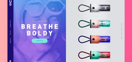
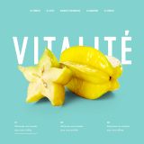
Hottest Mobile UI Design Examples:


Author Author :- Sylvia M Lewis is a design consultant at Logo Pearl where she serves as a custom logo designer, she also writes for different design blogs in his spare time. You can follow her on Facebook.


